INKA VIKSTEN
illustrator and graphic designer
home


digital art
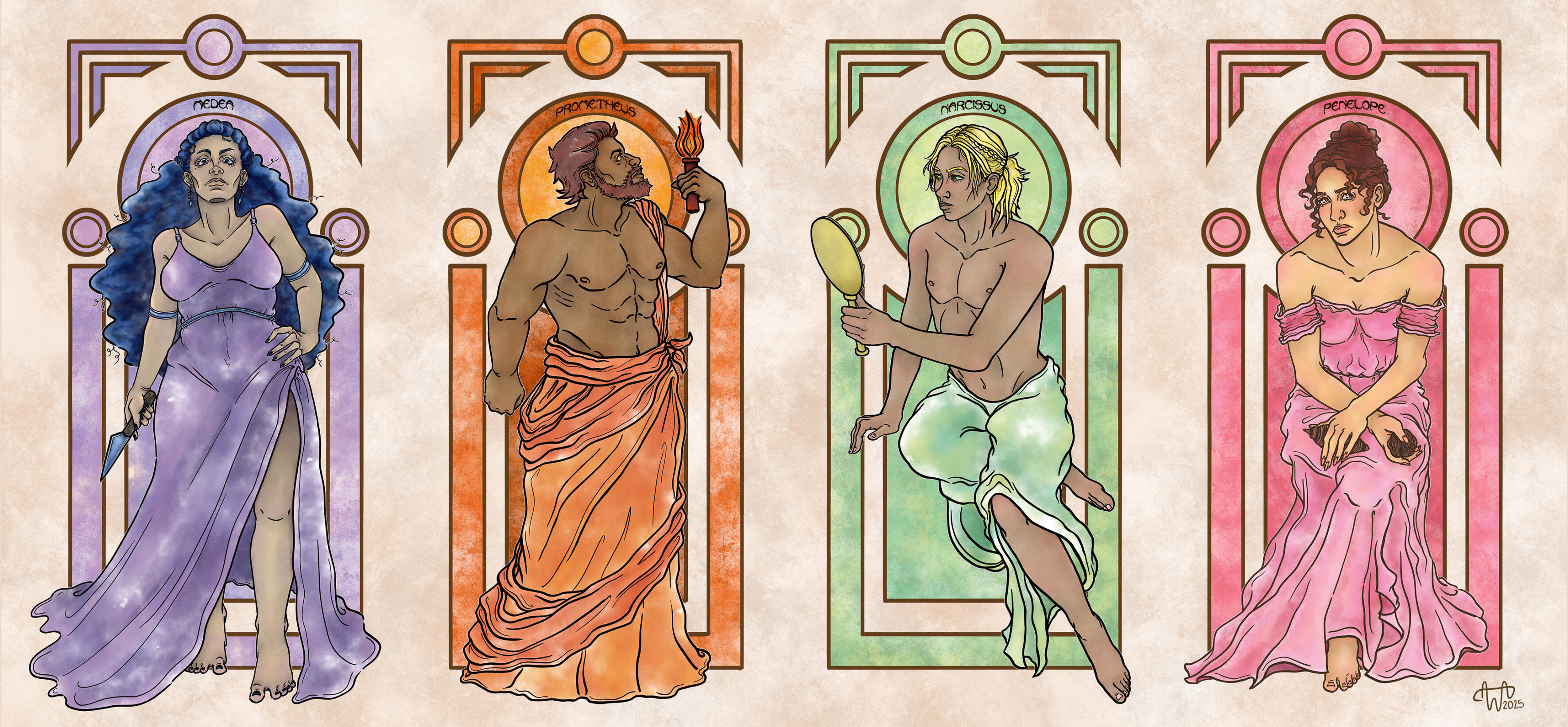
Love as a Motif
4134 × 1919px, Photoshop, 2025
Art exhibition piece – Love as a Motif
Our graphic design class organized a joint art exhibition called "Sadussa" (In a fairytail) and it was on display at a restaurant called Muusa during 5.2.-2.3.2025.The themes of the art exhibition were mythology, mythical creatures and fairy tales. I ended up delving into how love is presented in various epics of ancient Greek mythology and thus ended up making this art piece that features characters from different tales, which specifically deal with where love can take you in life. The title of the work "Love as a Motif" comes from this idea that love is an essential force and motive that drives you in life.
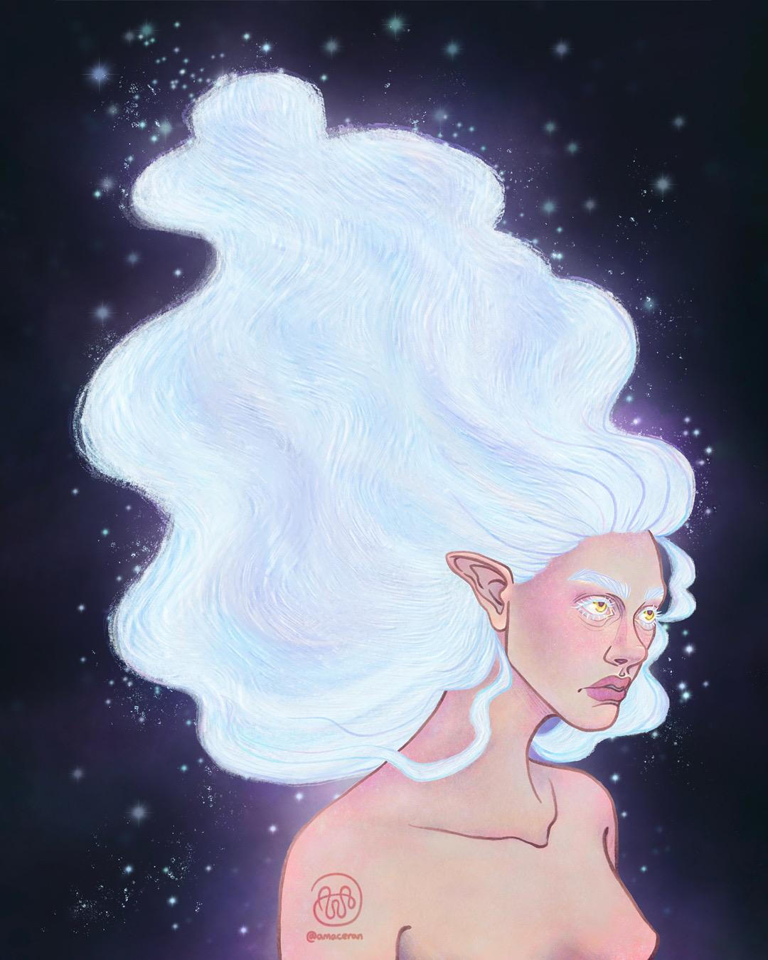
Cosmic
1080 x 1350px, Procreate, 2026
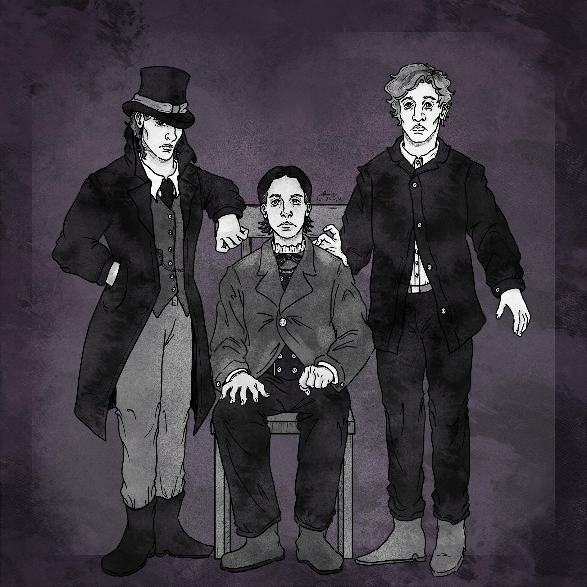
The Dead Cousins
1890 x 1890px, Photoshop, 2024
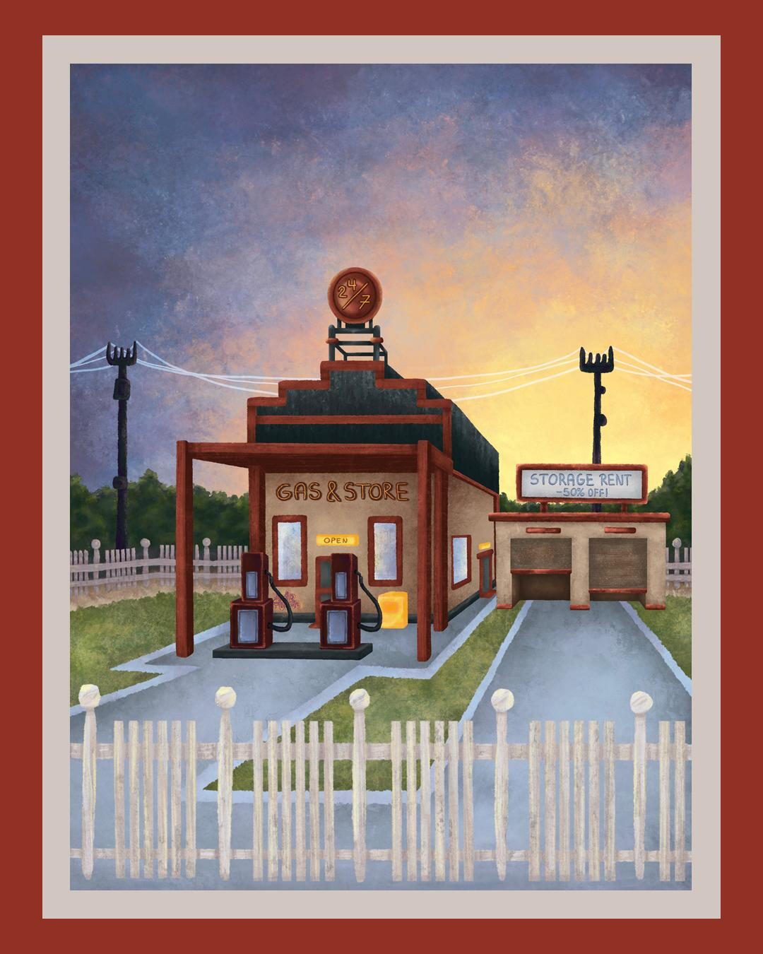
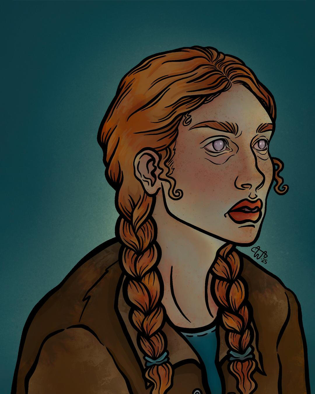
Good Morning!
1080 x 1350px, Procreate, 2026
Shadow Self
1080 x 1350px, Procreate, 2026
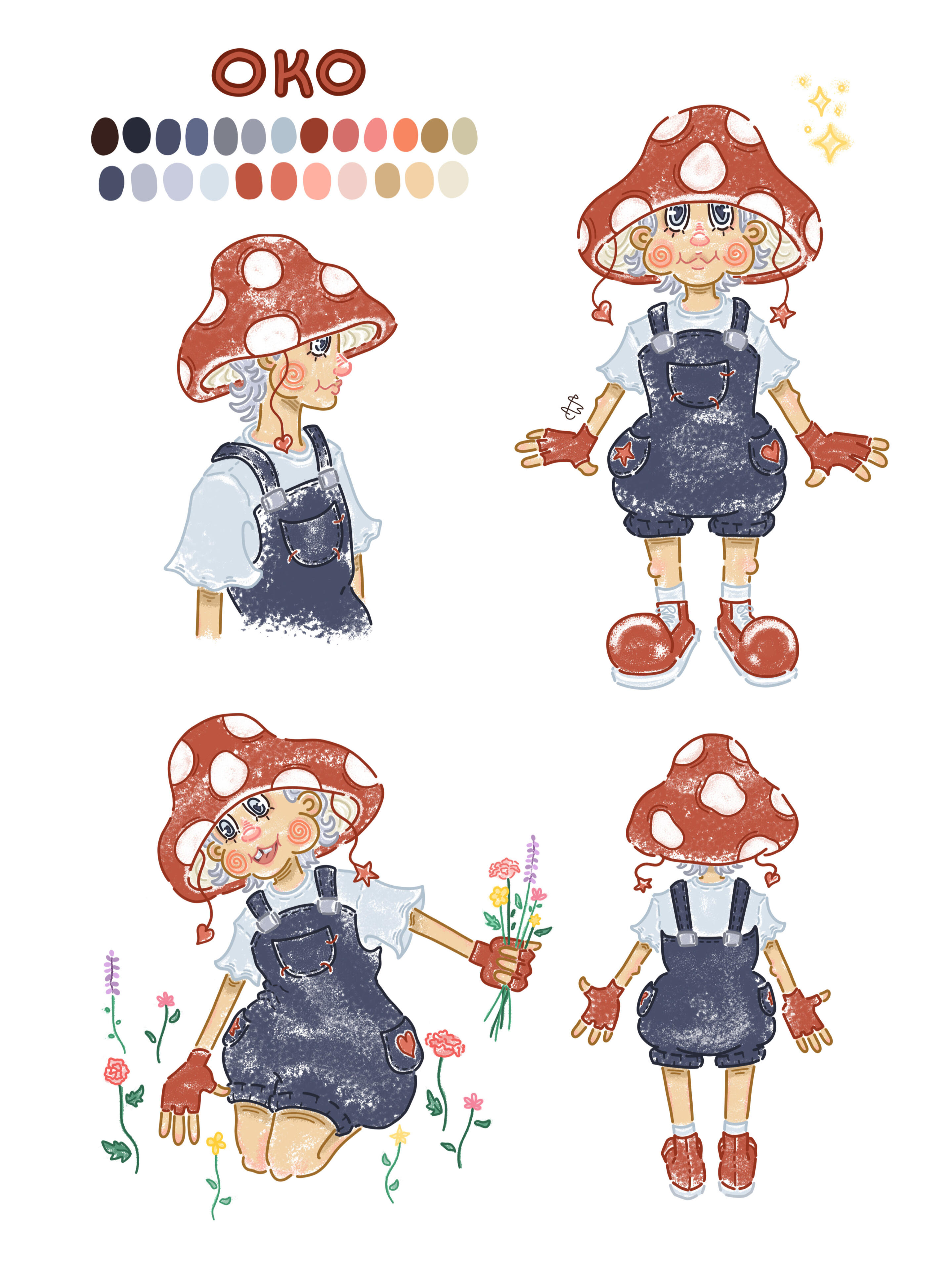
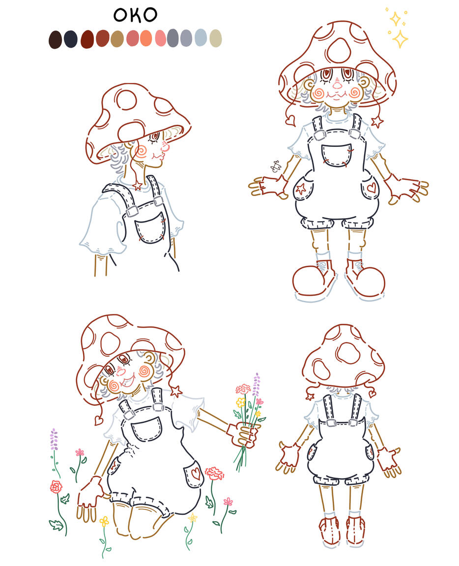
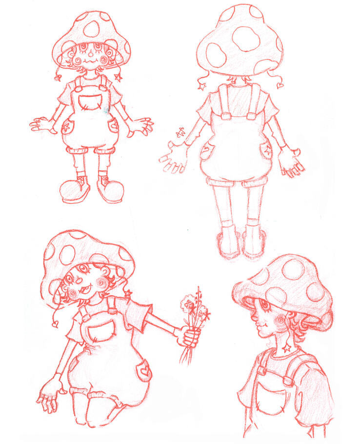
Character design
A3, Photoshop, 2024
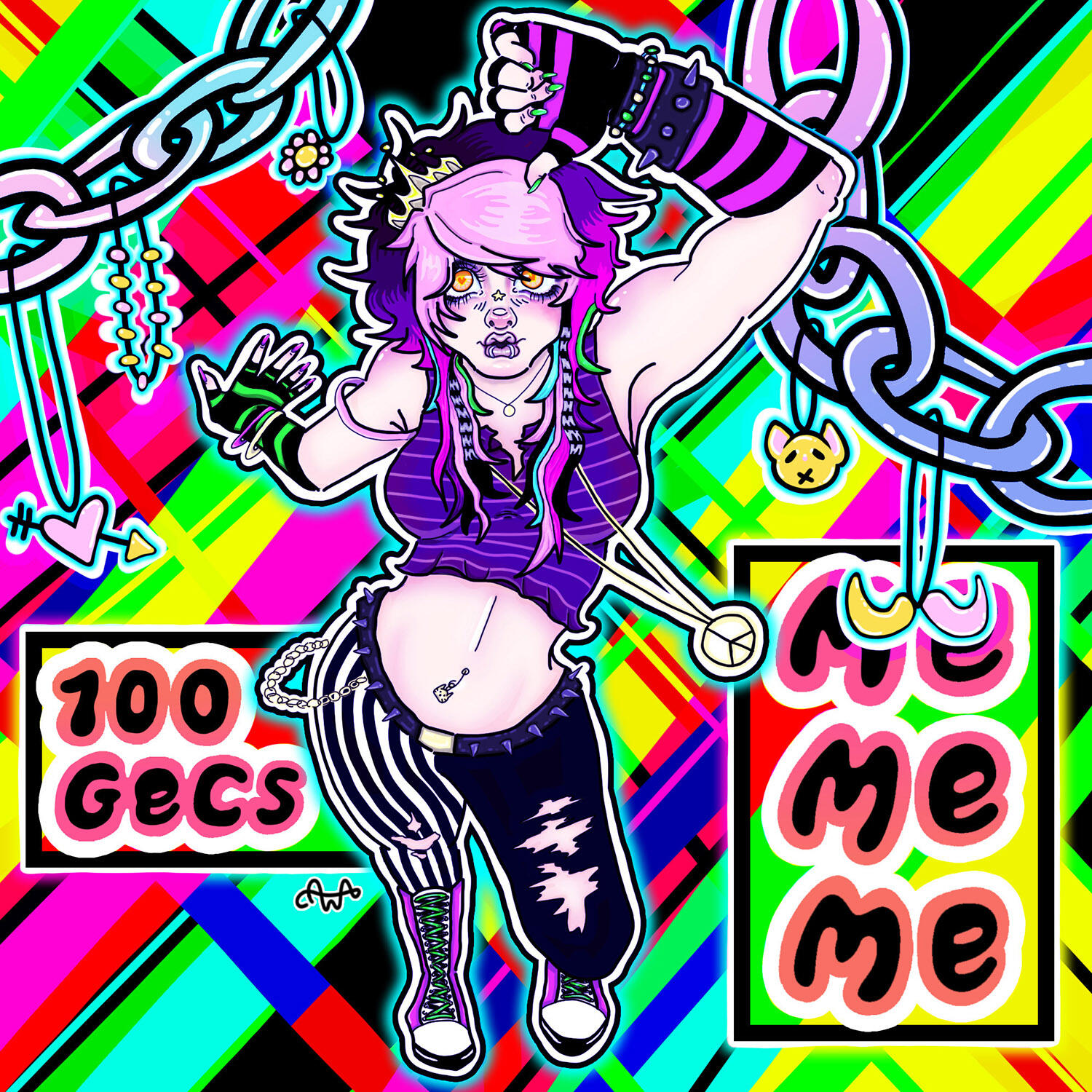
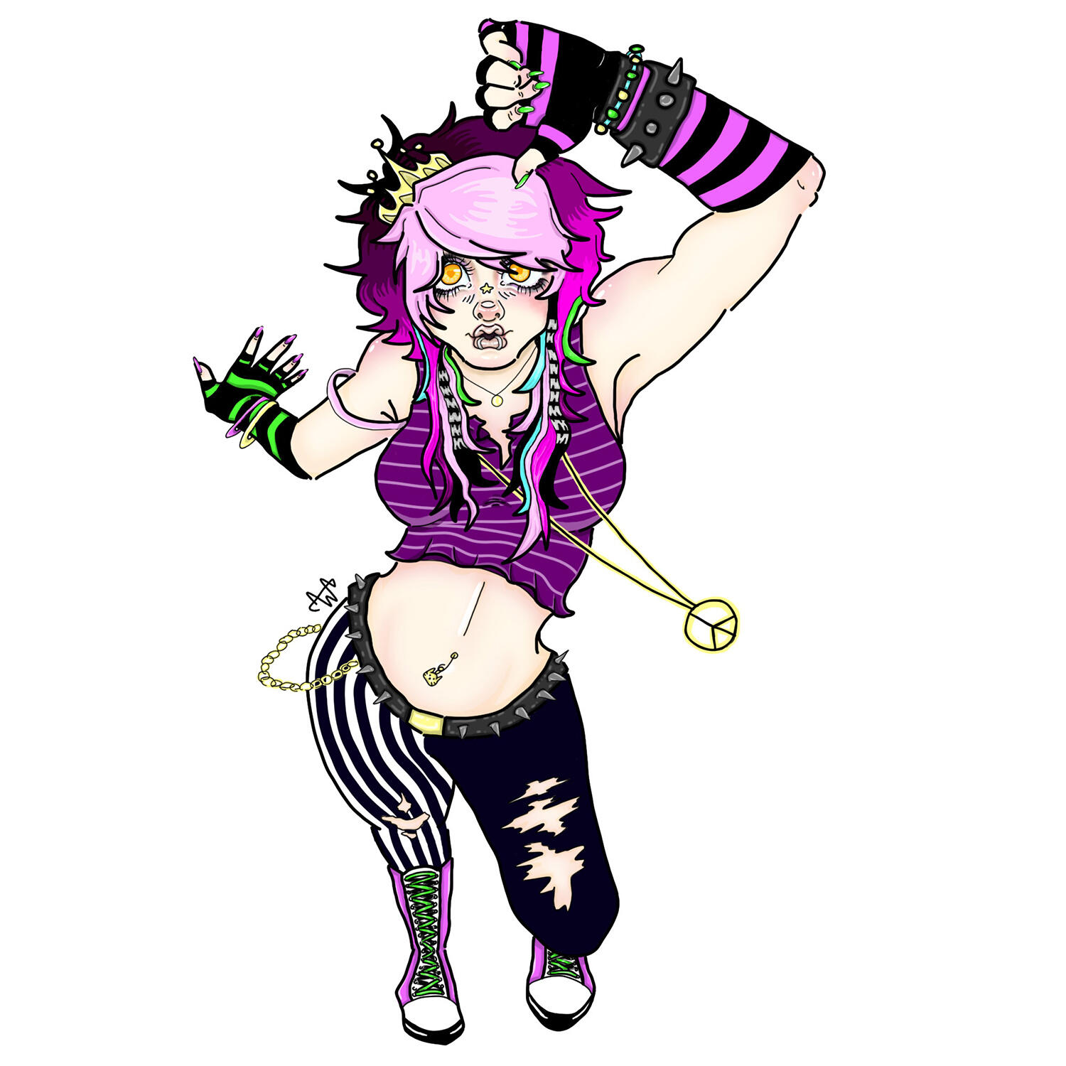
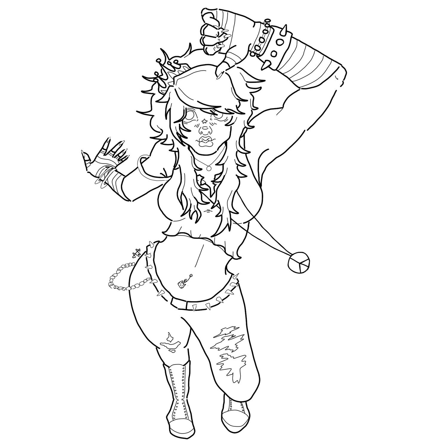
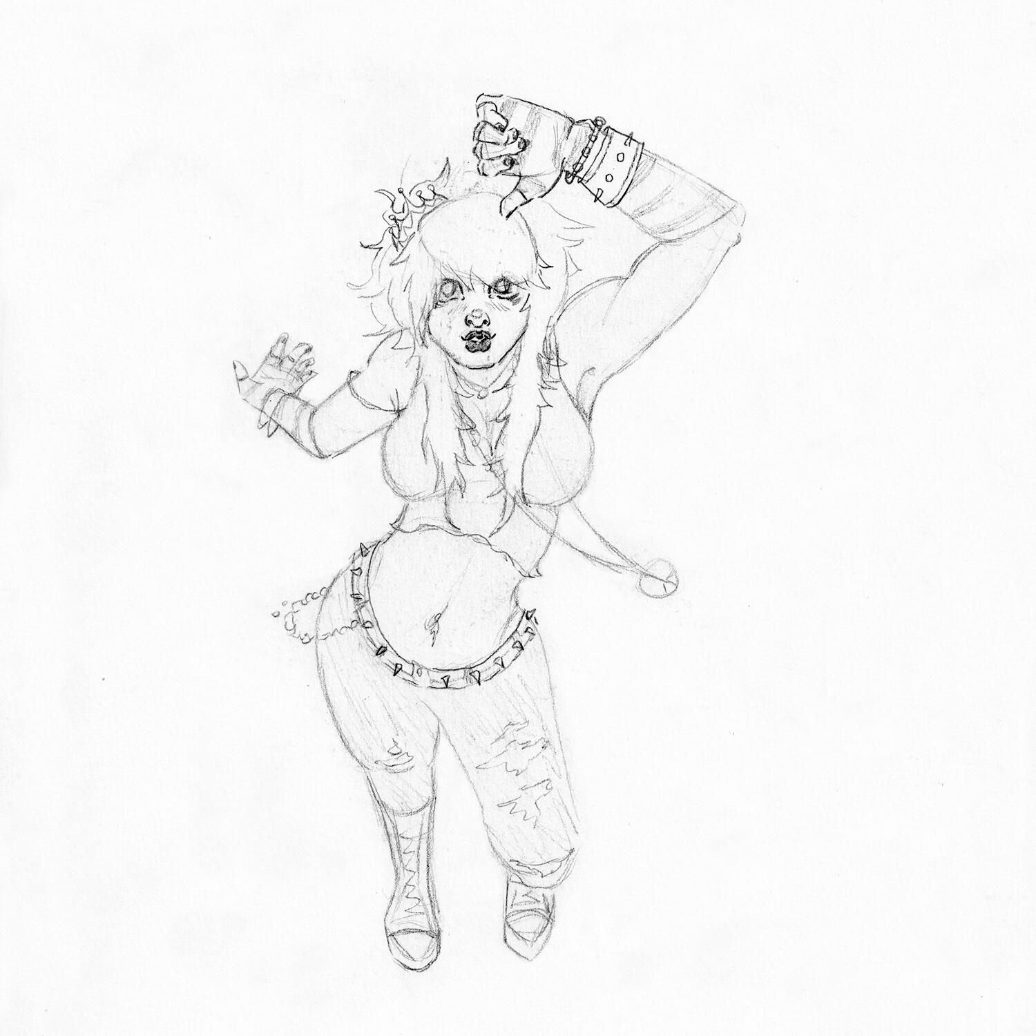
Bring Cringe Back!
2000 x 2000px, Photoshop, 2023
traditional art
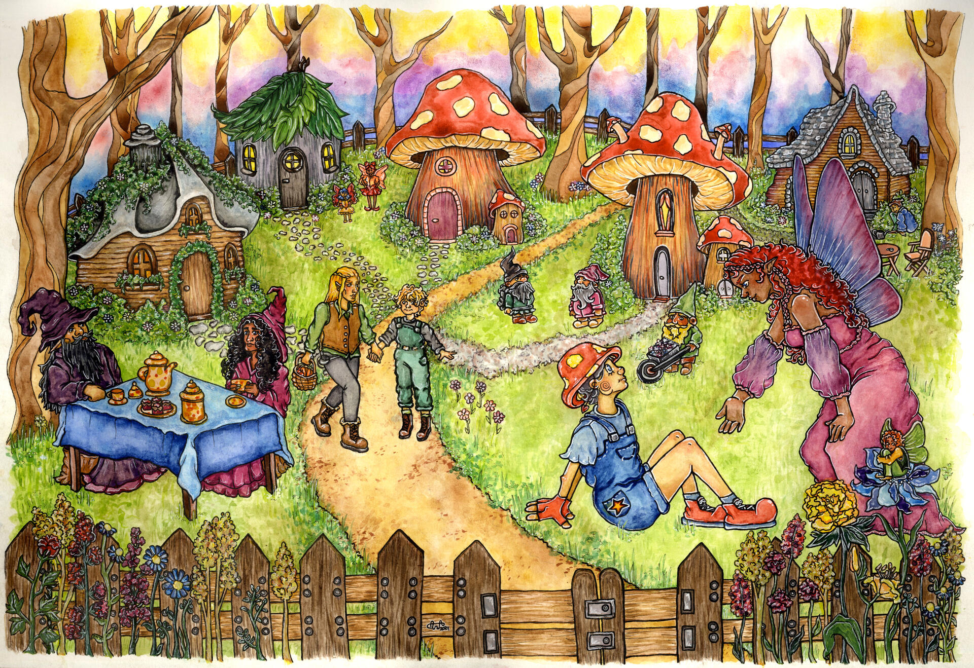
Life in the Garden
42cm x 29,7cm, watercolor, colored pencils, ink pen, 2024
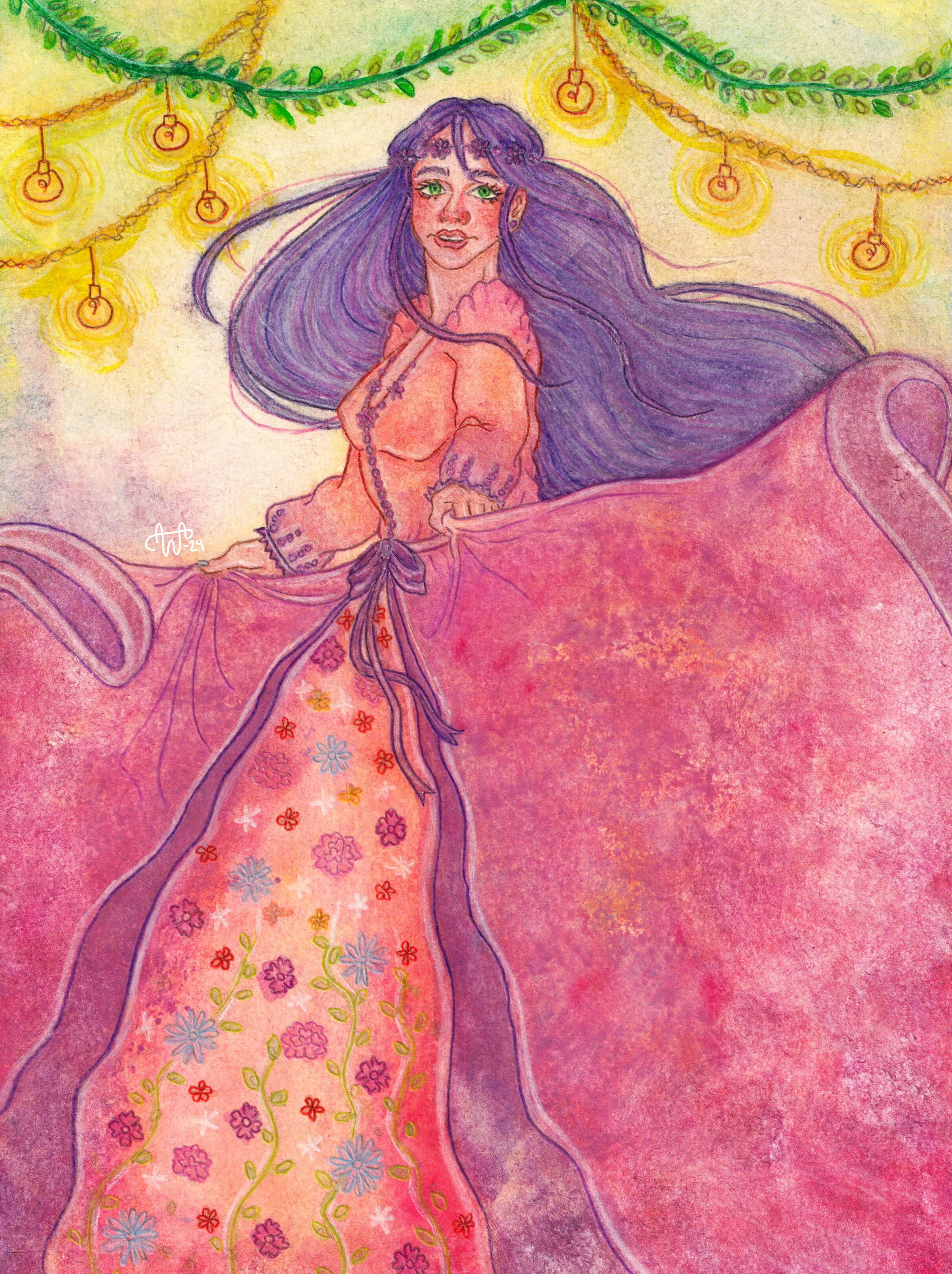
a Dance of Colors
21cm x 29,7cm, watercolor
and colored pencils, 2024
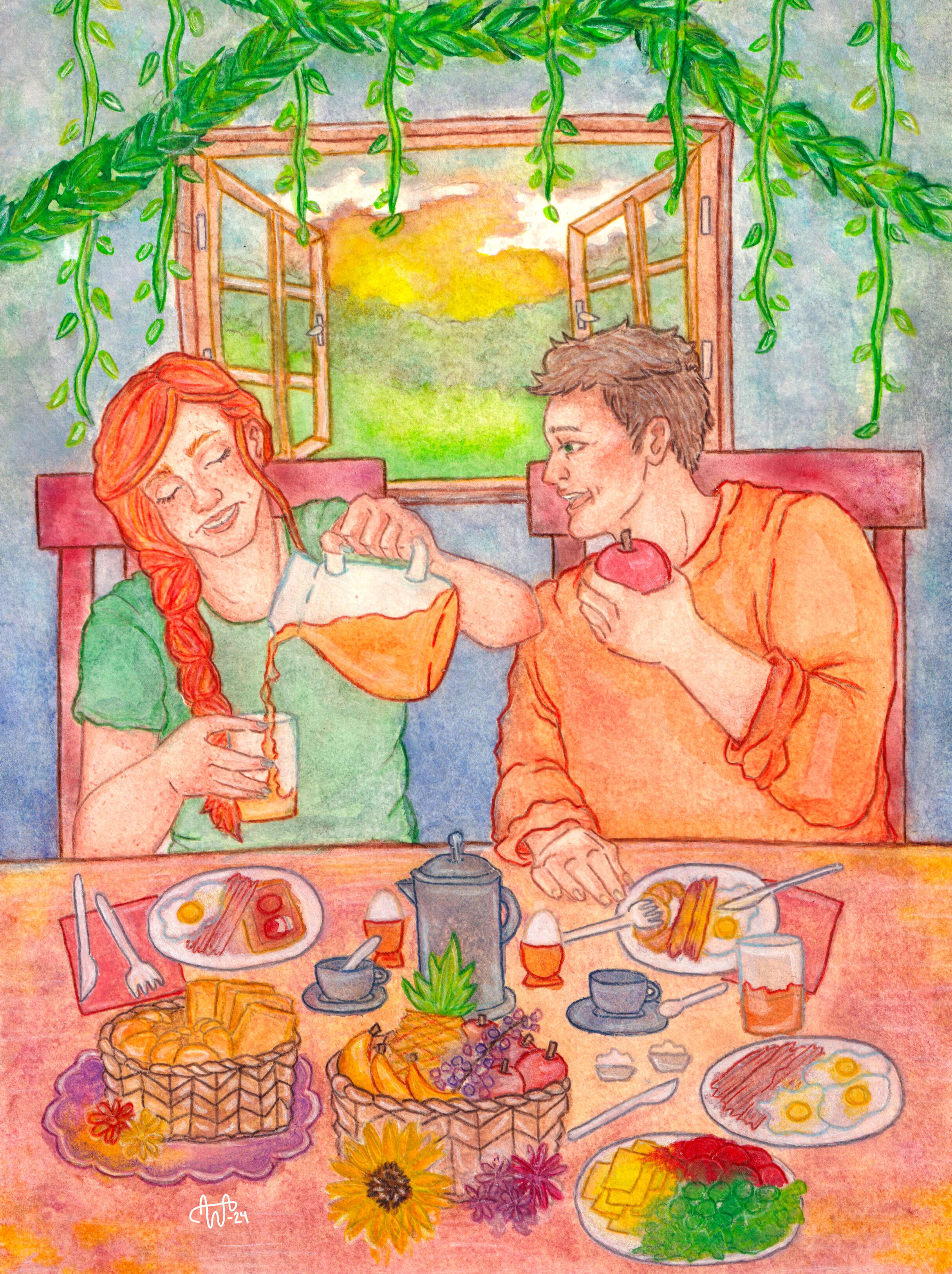
Breakfast
21cm x 29,7cm, watercolor
and colored pencils, 2024
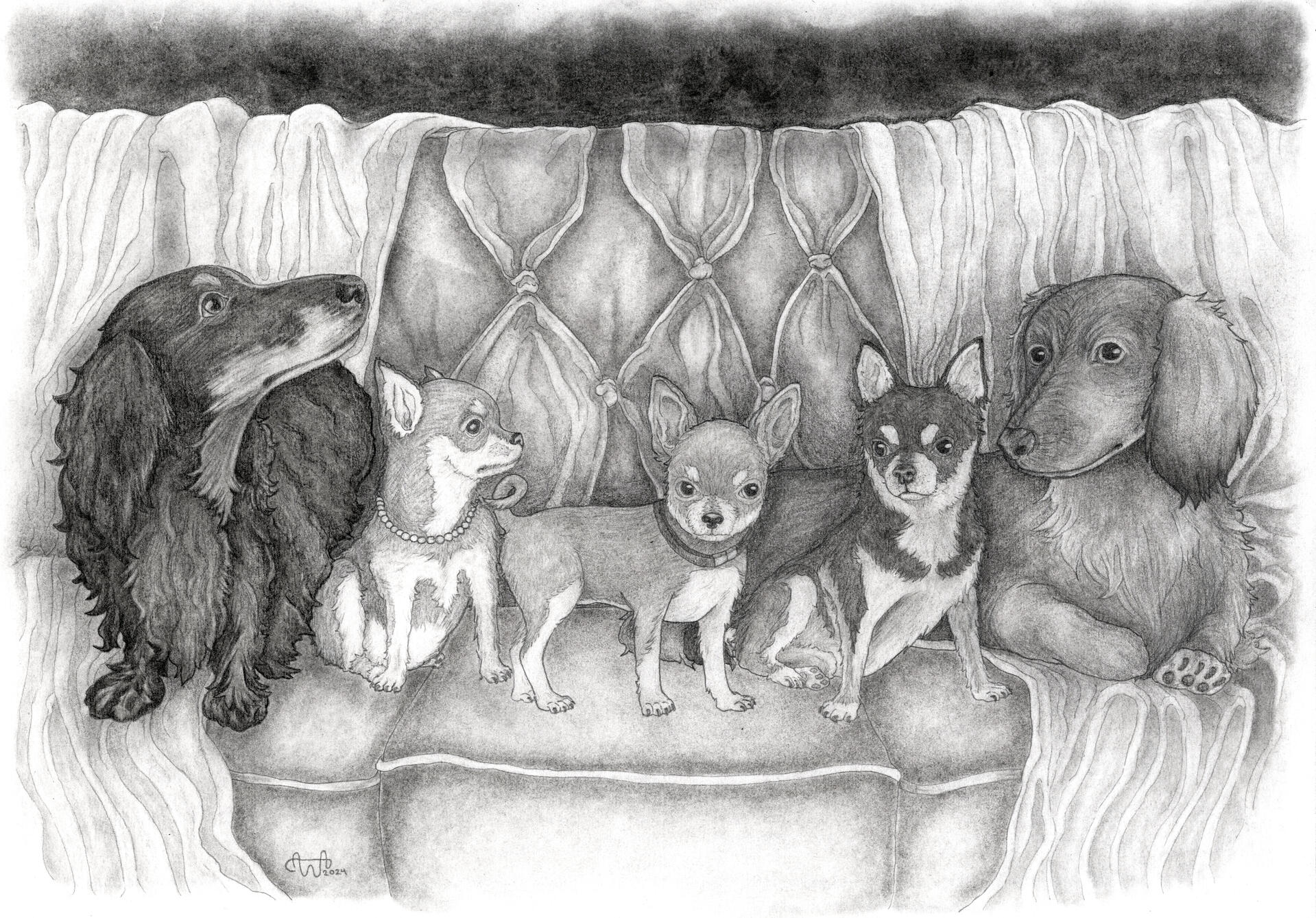
Picture Day
42cm x 29,7cm, charcoal pencils, 2024
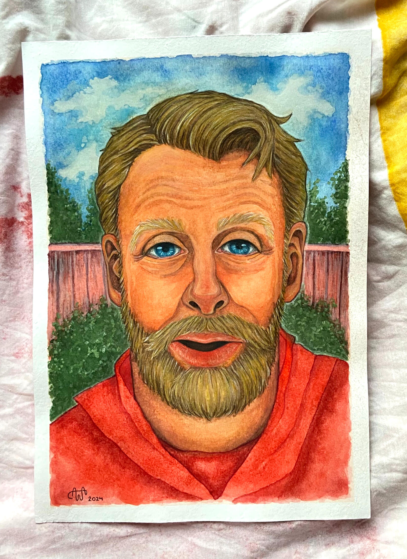
Portrait
21cm x 29,7cm, watercolor and colored pencils, 2024
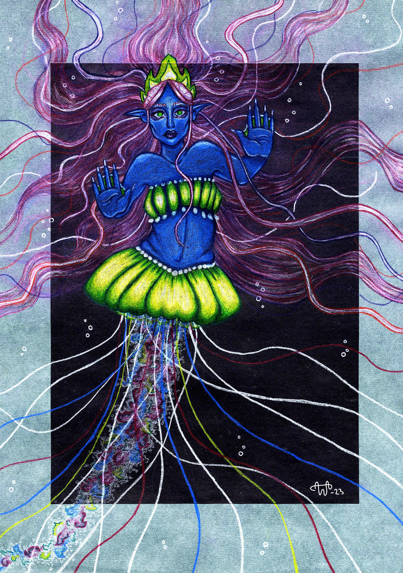
a World behind the Soul
29cm x 42cm, pastels and colored pencil, 2023
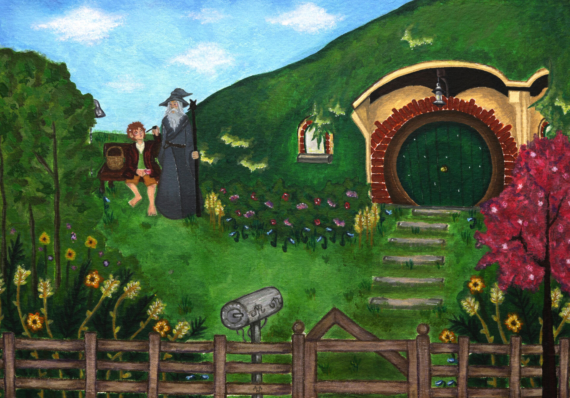
Tea at four
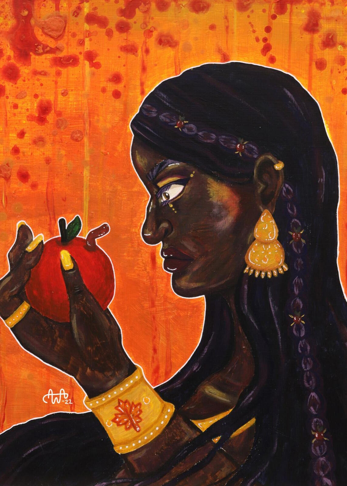
42cm x 29cm, acrylic, 2022
projects
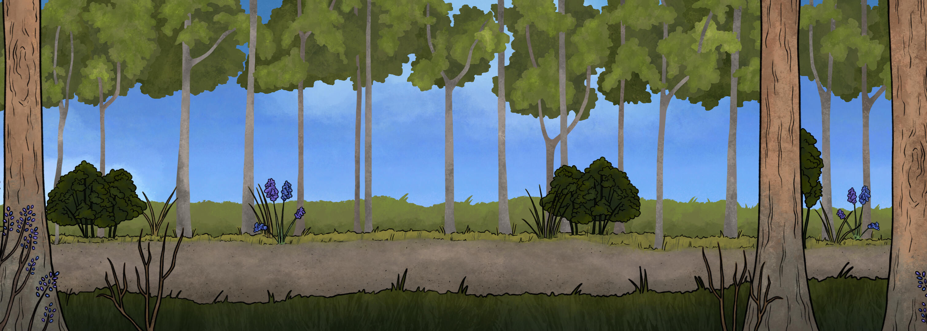
THE SONG OF BRILLIANCE
short animation
A hand drawn short animation that I created in 2026 as my final project while studying as a graphic designer. You can watch it or check out BTS material of the project via buttons down below.
URBAN MEADOW
visual identity of the project
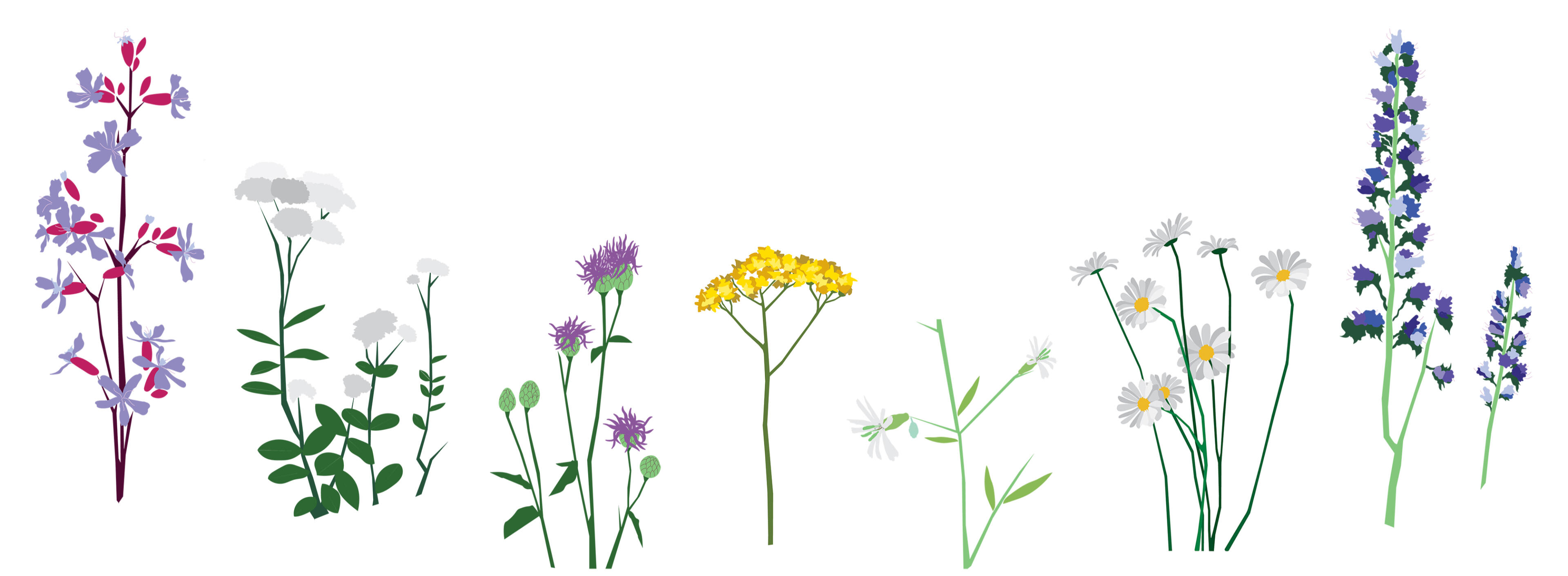
@kaupunkiniitty is an Instagram account documenting an urban meadow located in Tampere for which I created the visual elements used in its marketing and infographics during 2025-2026.
THE SEASONS
acrylic painting series
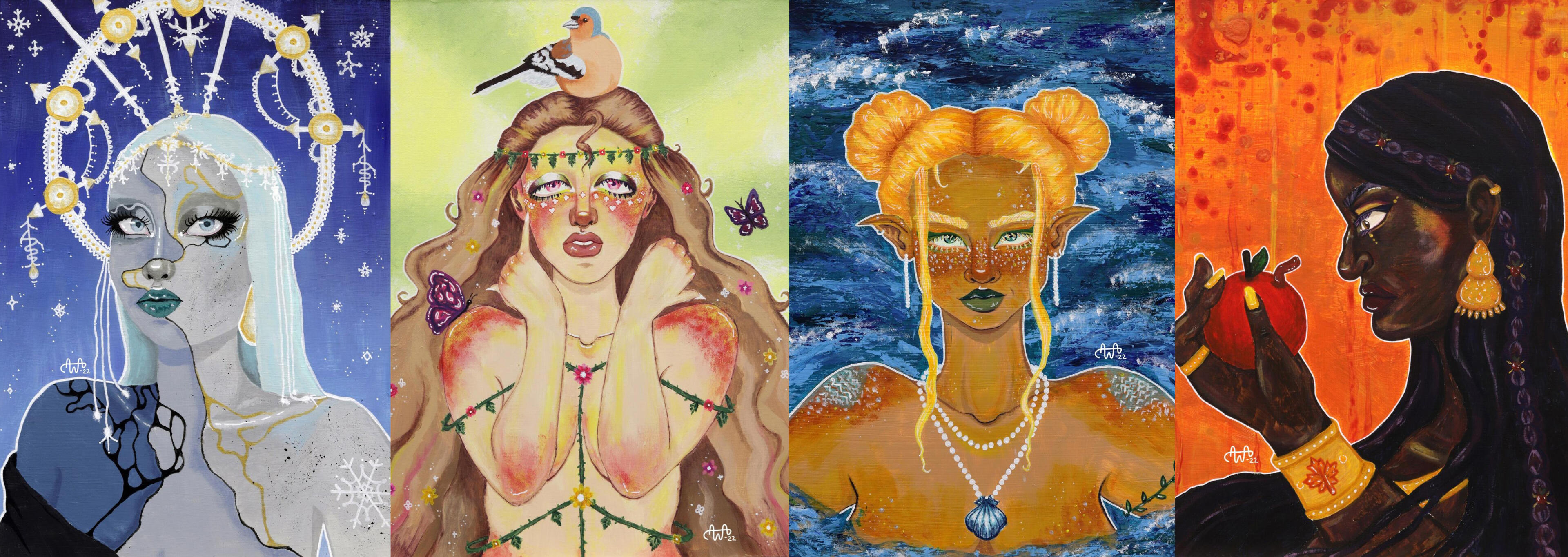
The Seasons is an acrylic painting series that I created during my studies at Ahlman and it was on display at an art exhibition organised by Ahlman’s art students in the spring of 2022.
THE RAVEN
collection of illustrations
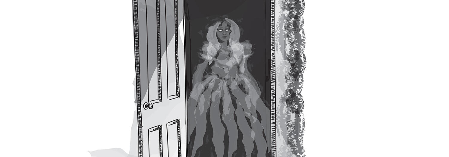
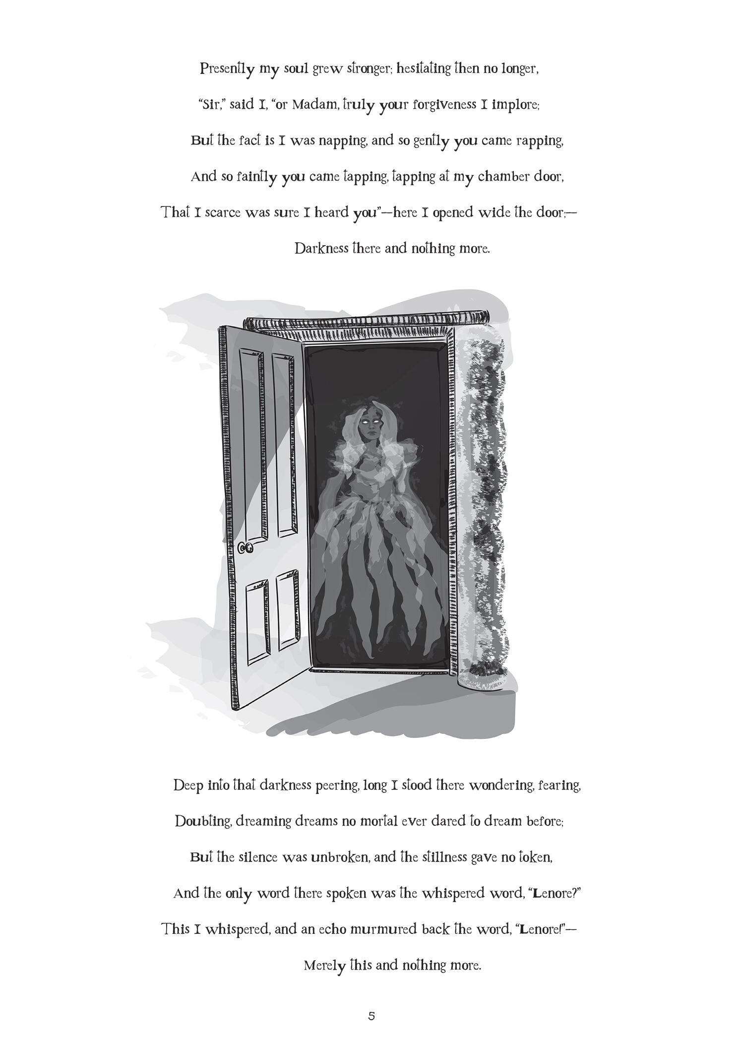
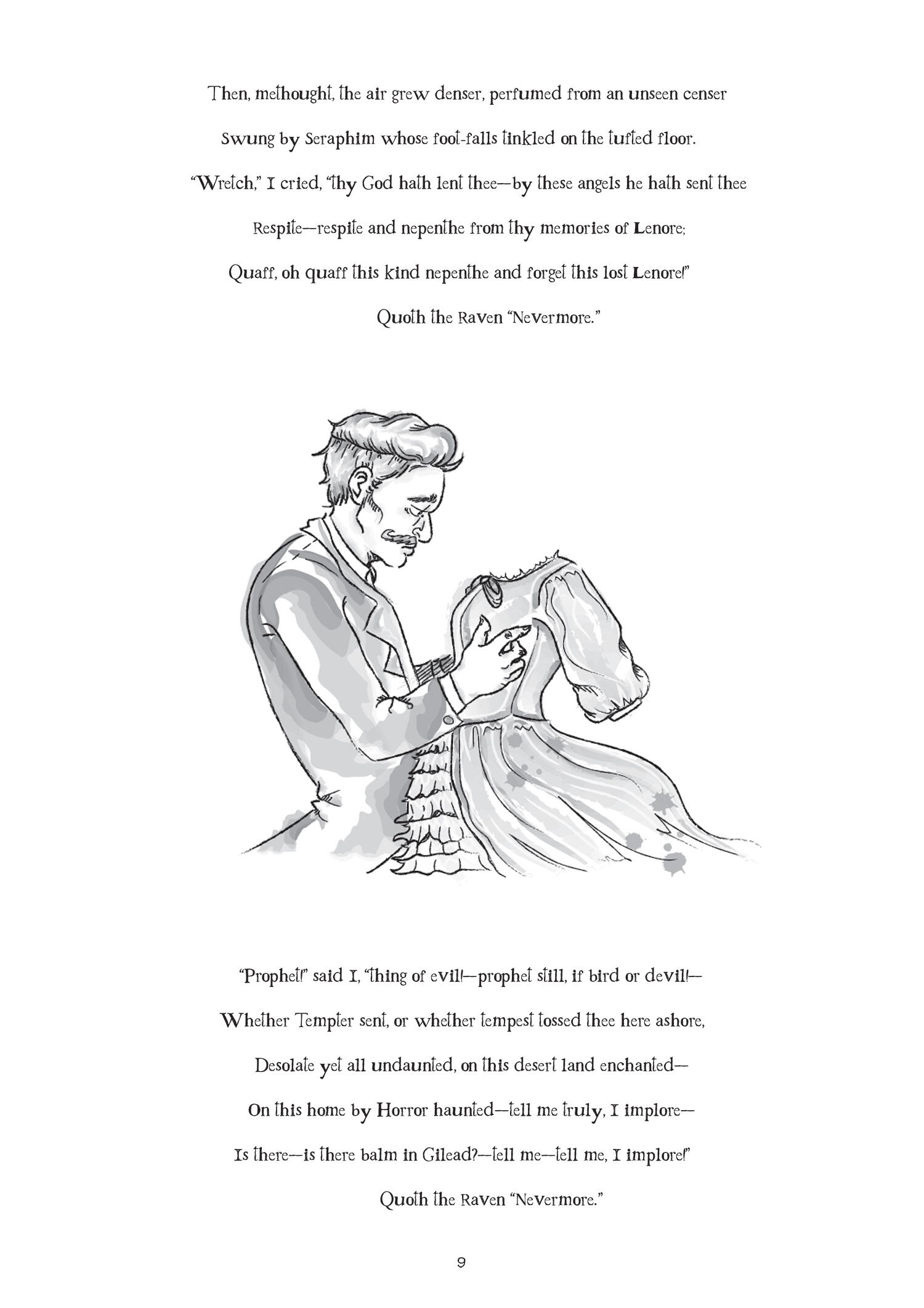
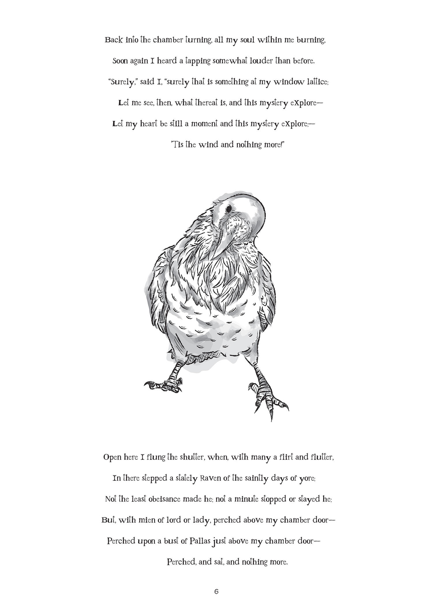
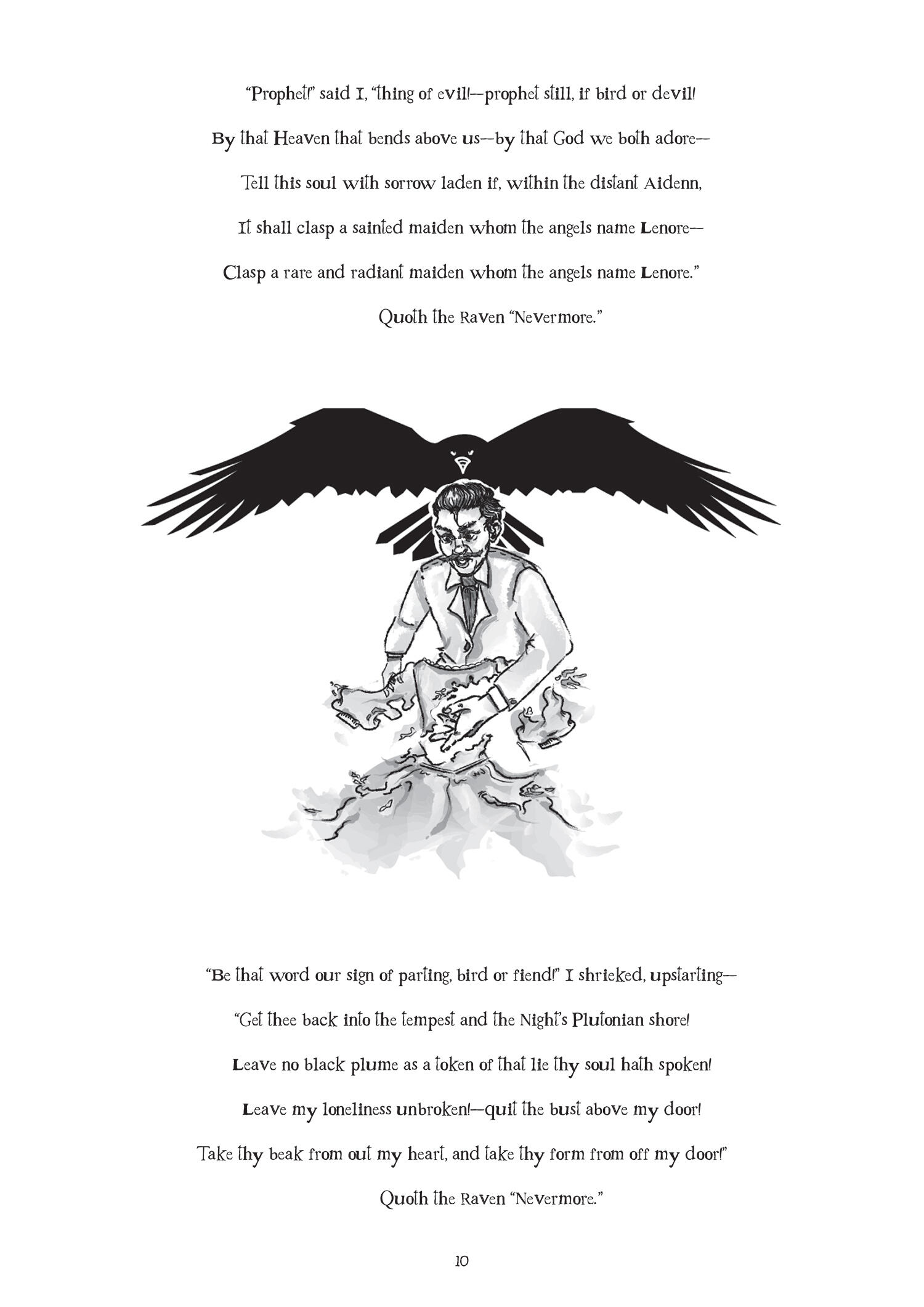
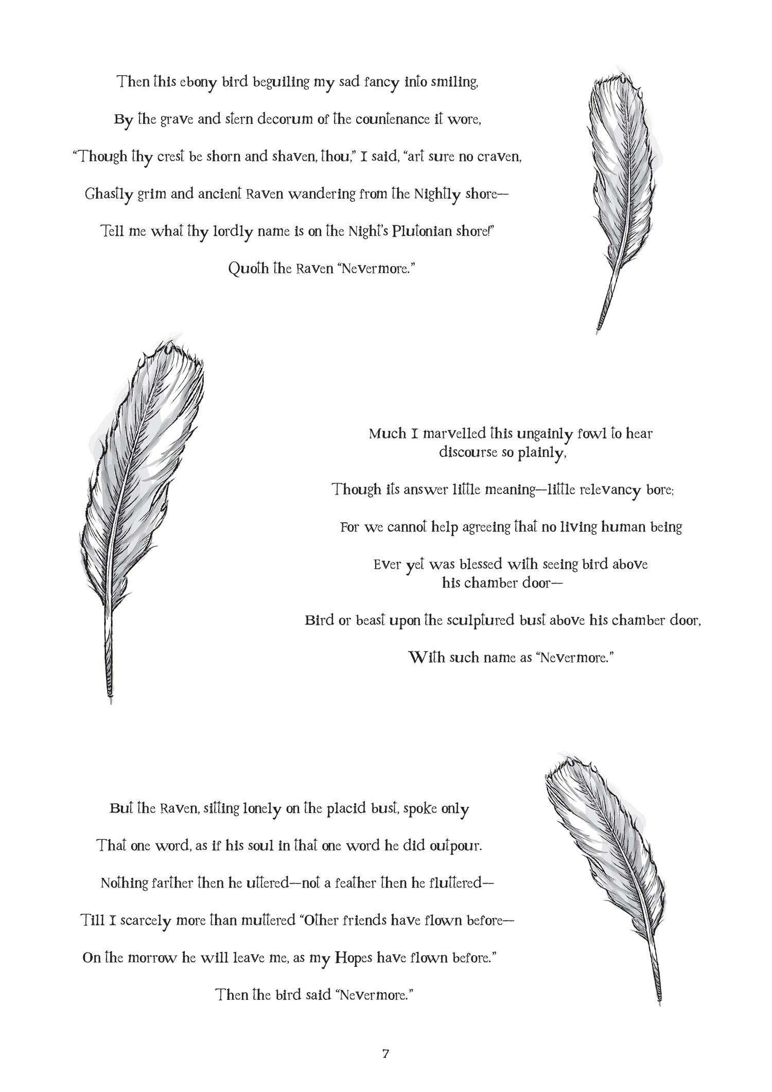
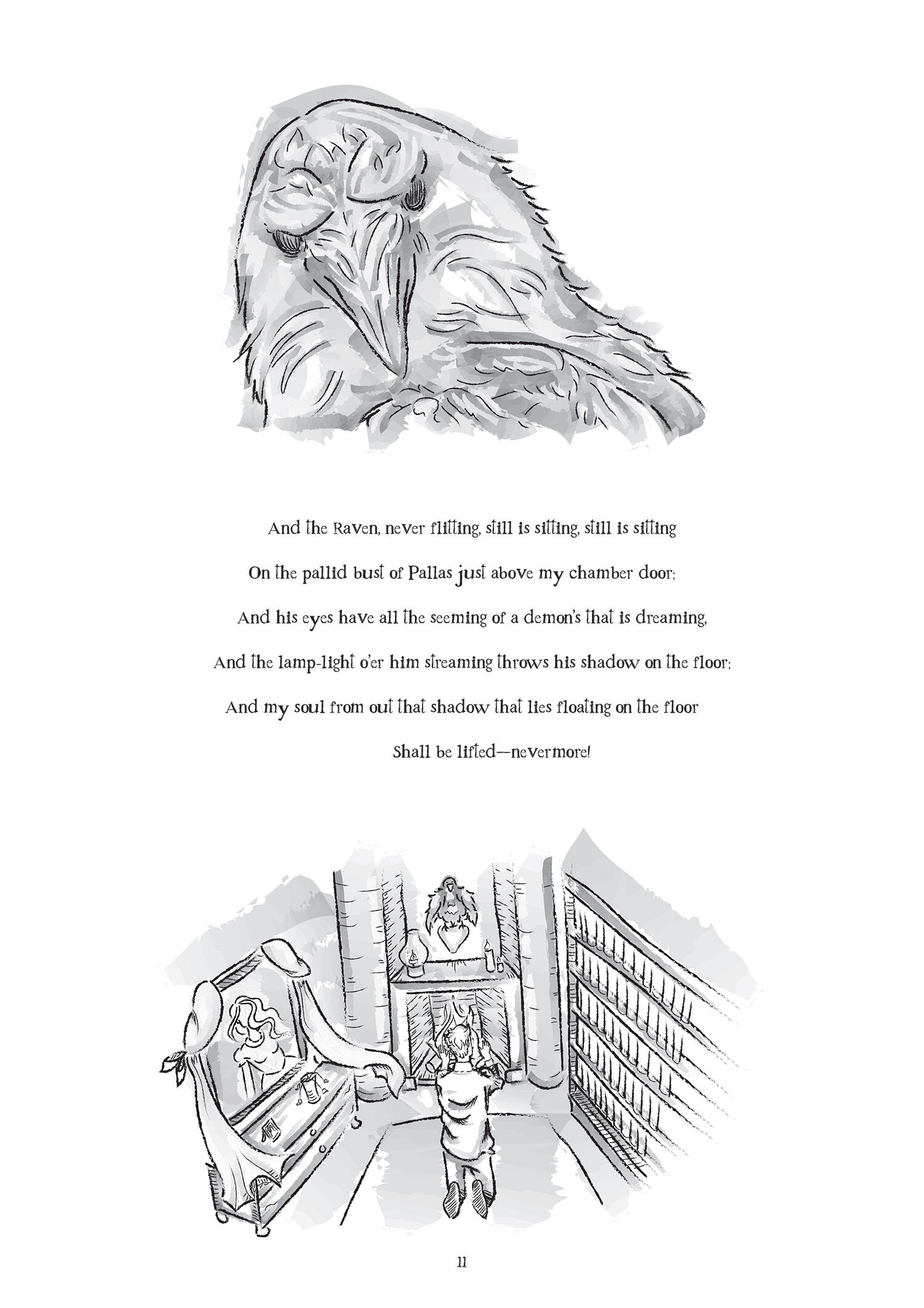
An illustration project created in 2023 for Edgar Allan Poe’s famous poem ”The Raven” including a book cover and 12 black and white vector drawings alongside the poem.
The song of brilliance
I have loved animation since I was young and have great respect for professionals in the field, yet I had never really delved into it properly myself. That is why I wanted to create a short animation as my school's final project to gain a concrete understanding of every stage of the process and I ended up working on this project for over six months.This project taught me a great deal, both about animation and about myself. It was incredibly labor-intensive and time-consuming, yet enjoyable and rewarding. When I look back at myself at the start of this project, the word "naive" comes to mind. I knew animation was hard work, but I had no idea just how massive this project would eventually become. However, I received support, help, and advice from others throughout the process, and I am truly grateful for it.
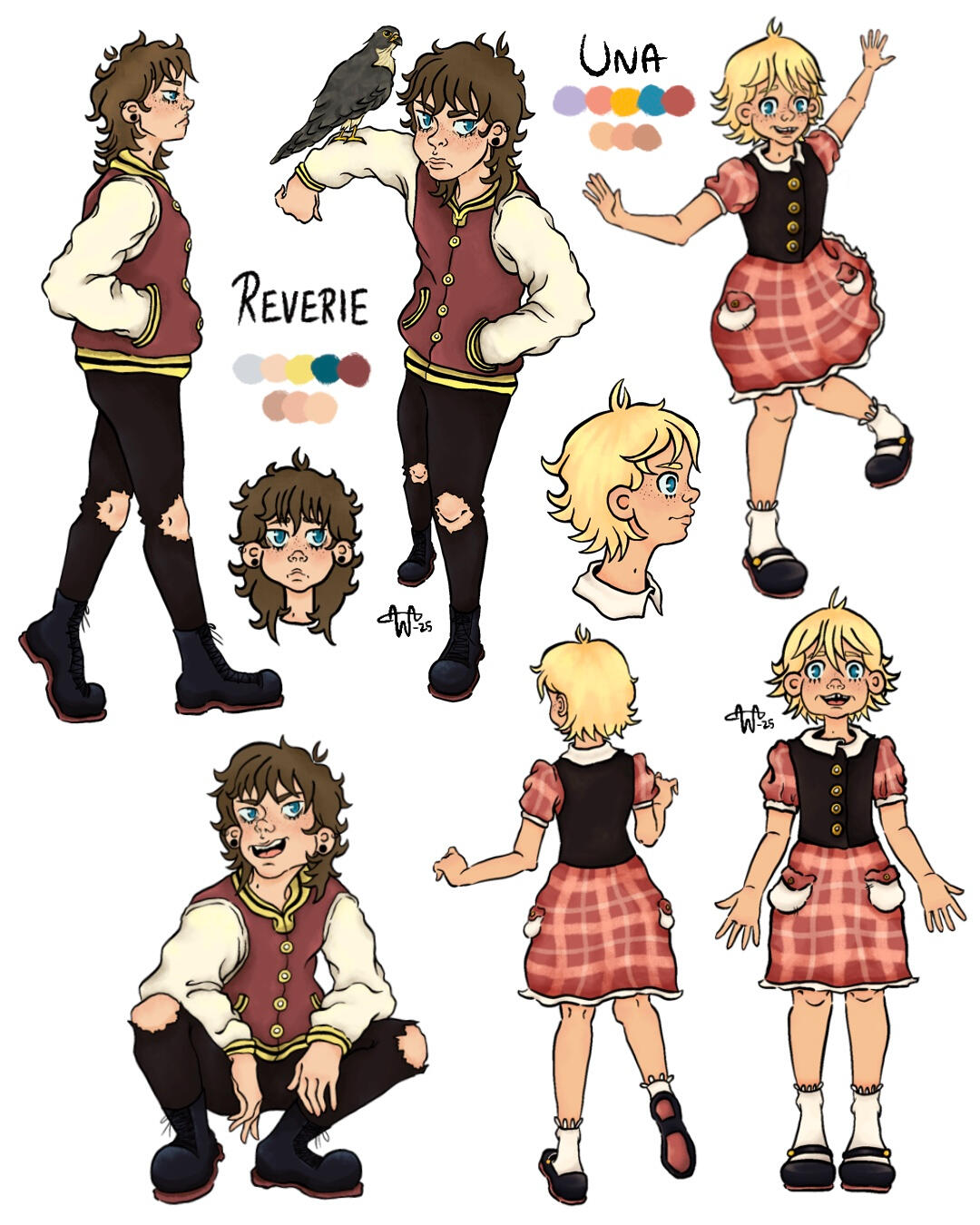
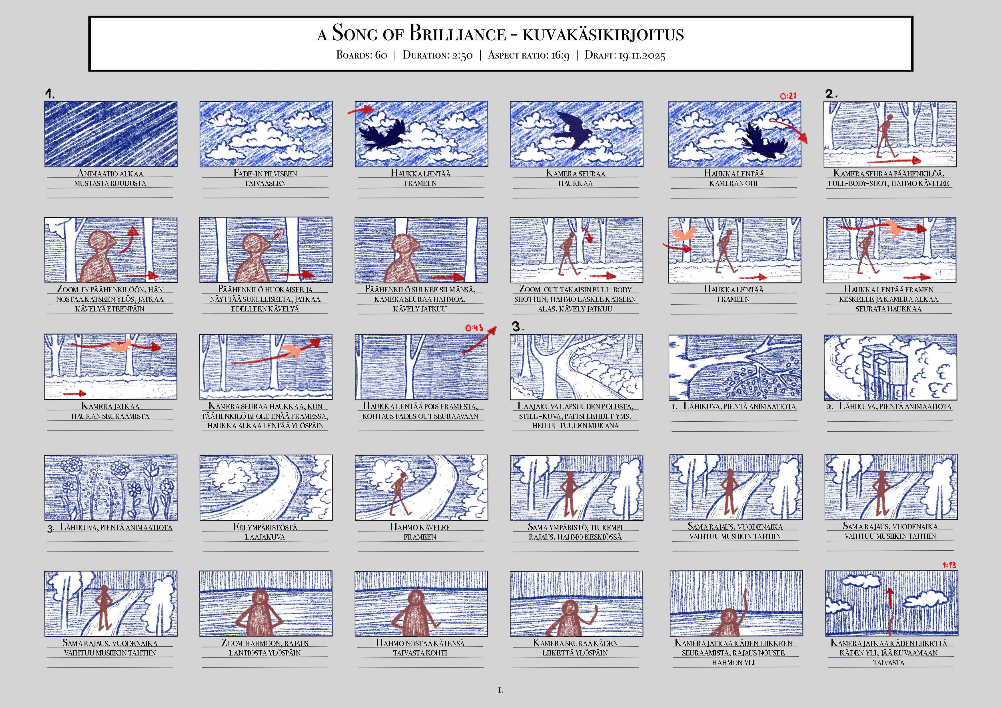
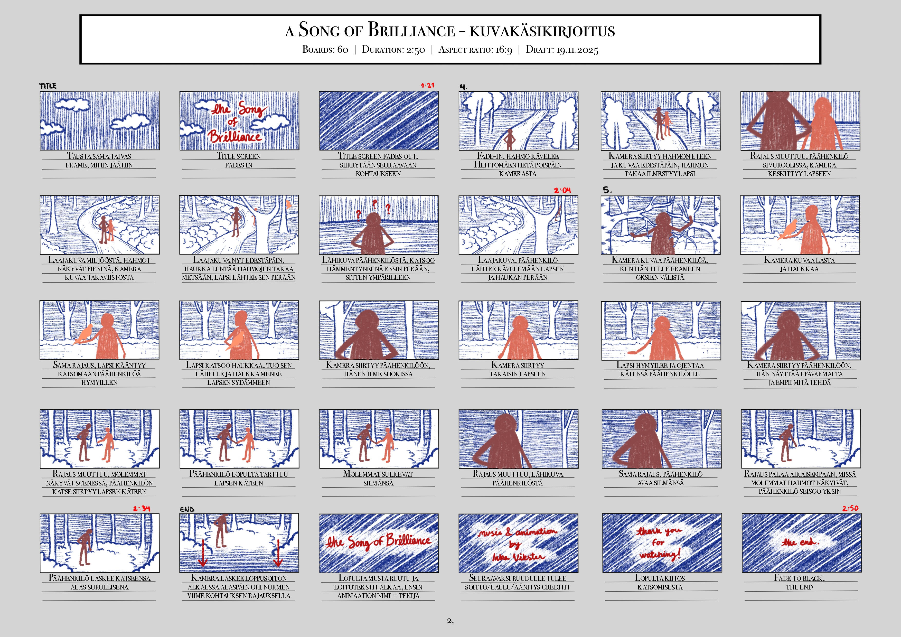
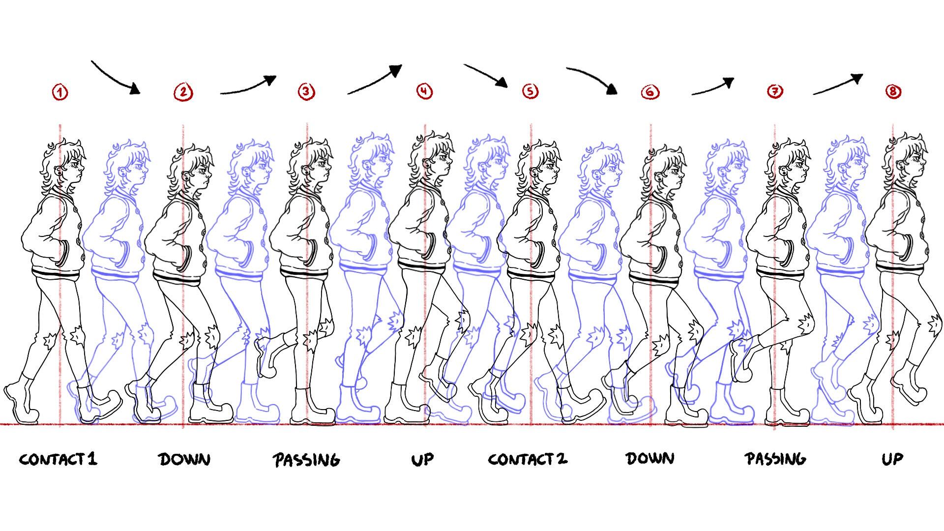
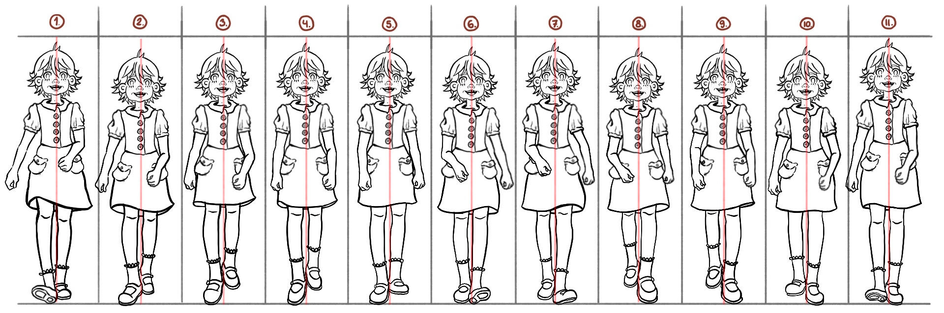
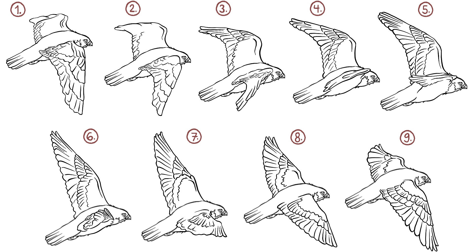
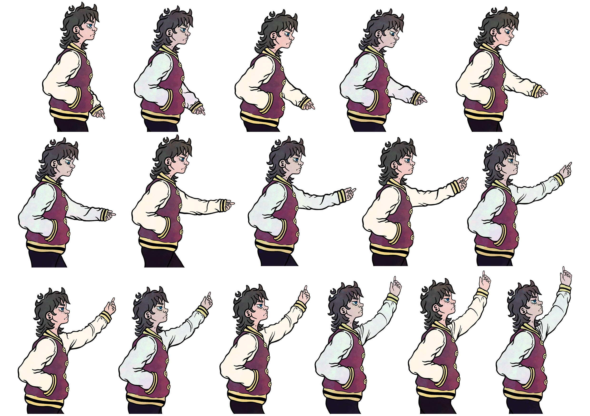
I began the project by creating character designs and the storyboard for it in June of 2025.I already knew at this stage that the song "Teru no uta", which is featured in the Studio Ghibli film "Tales from Earthsea", would play in the background of the animation, so I began structuring the narrative by printing out the lyrics with wide line spacing and dividing the text into sections; this allowed me to jot down notes and sketch out potential scenes I wanted to include. Throughout the process of building the scenes, I kept the project's audio component in mind, adjusting and testing the flow and rhythm as the storyline gradually took shape.During winter of 2026 I started working on character animations—specifically, with the walk cycles. I produced all the walk animations using Procreate with its built-in "Animation Assist" tool, which generates an animation from the drawings based on selected settings and treating each layer as an individual frame. Alongside the walk cycles, I also drew different movements for the hawk.Then I moved on to creating various character animations—such as the hand-raising gesture shown in the image and facial expressions as the characters react to their surroundings.
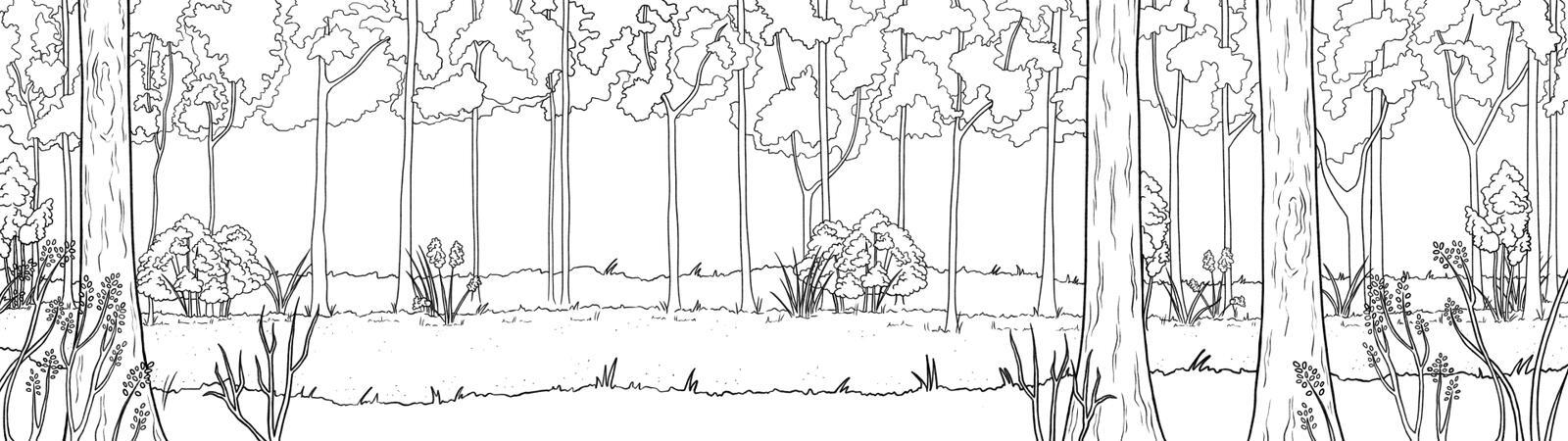
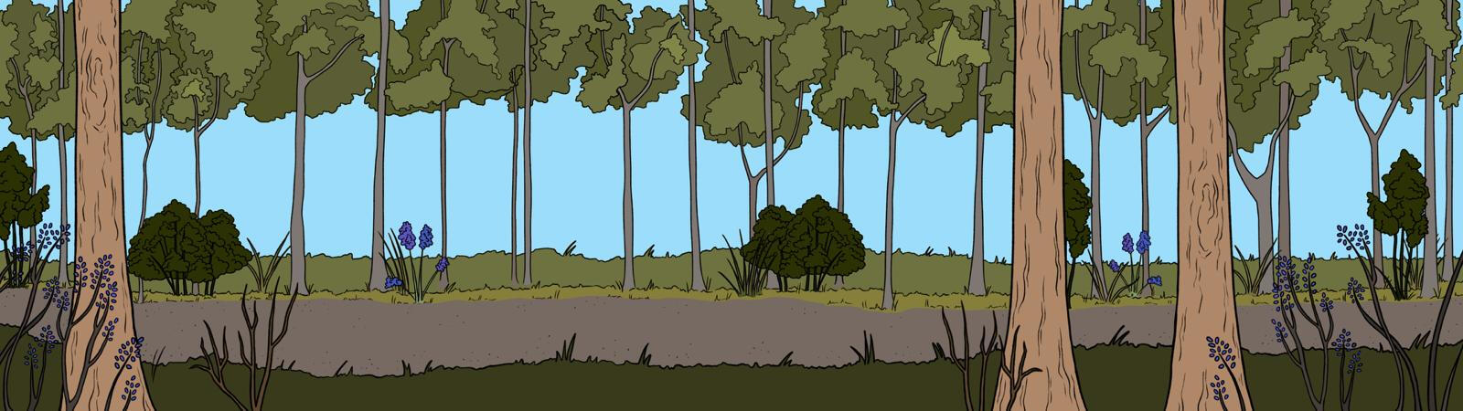
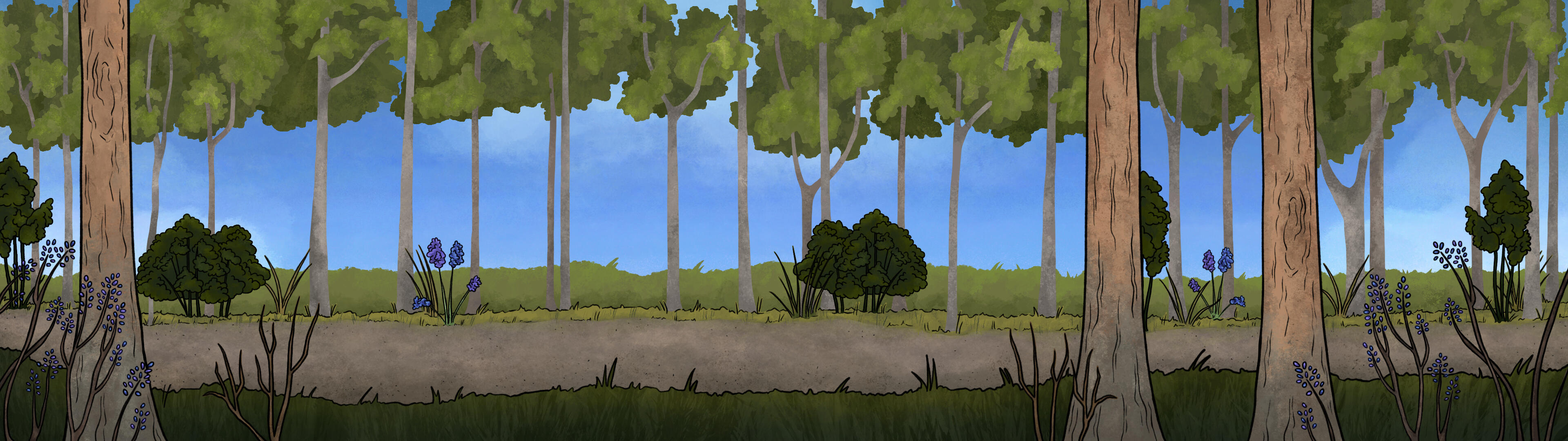
I began working on the backgrounds by first taking pictures of the neighborhood where I grew up and using them as a reference for my sketches.I spent a long time considering how much detail I wanted the backgrounds to have. From the very start of the project, I envisioned an animation with a messy, almost mixed-media style, so I set out to develop that concept. I was also inspired by a painterly quality, brush-stroke textures, and a hazy, dreamlike atmosphere. I created various textured backgrounds and then used them on top of the flat color layer using blending modes.Since the camera generally follows the characters in these scenes, I created most of the backgrounds with dimensions of 3840x1080px, making them twice as wide as the standard animation size. This provided enough background for even longer walking sequences, allowing me to pan from edge to edge throughout the scene.Finally I moved on to working in After Effects. Towards the end of the production process, I began rendering individual clips and scenes so I could start assembling the project. I also downloaded the background song as an MP3-file to my computer. When I got editing all the scenes together and synchronizing them with the background music, I added the end credits and the project was finally done.
Check out "The Song of Brilliance" short animation on YouTube by clicking the YouTube icon down below!
urban medow
@kaupunkiniitty is an Instagram account documenting the creation and growth of an urban meadow located in Tampere at the Sammonkulma housing company. The account was created by photographer Marjaana Malkamäki and Anna Isotalo.It is a vital part of a larger meadow project, serving as a platform to promote the concept of housing company meadows to potential adopters and to educate
the public on important topics such as biodiversity and the benefits of meadows for various types of plants, insects,
and micro-habitats.Planning for the meadow began in 2023, and it was officially established in May
of 2025. I worked on this project during 2025-2026, creating the visual elements
for its marketing and infographics.
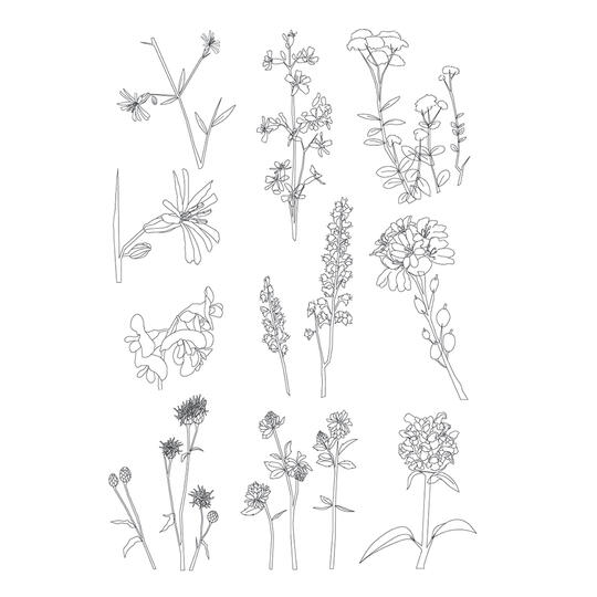
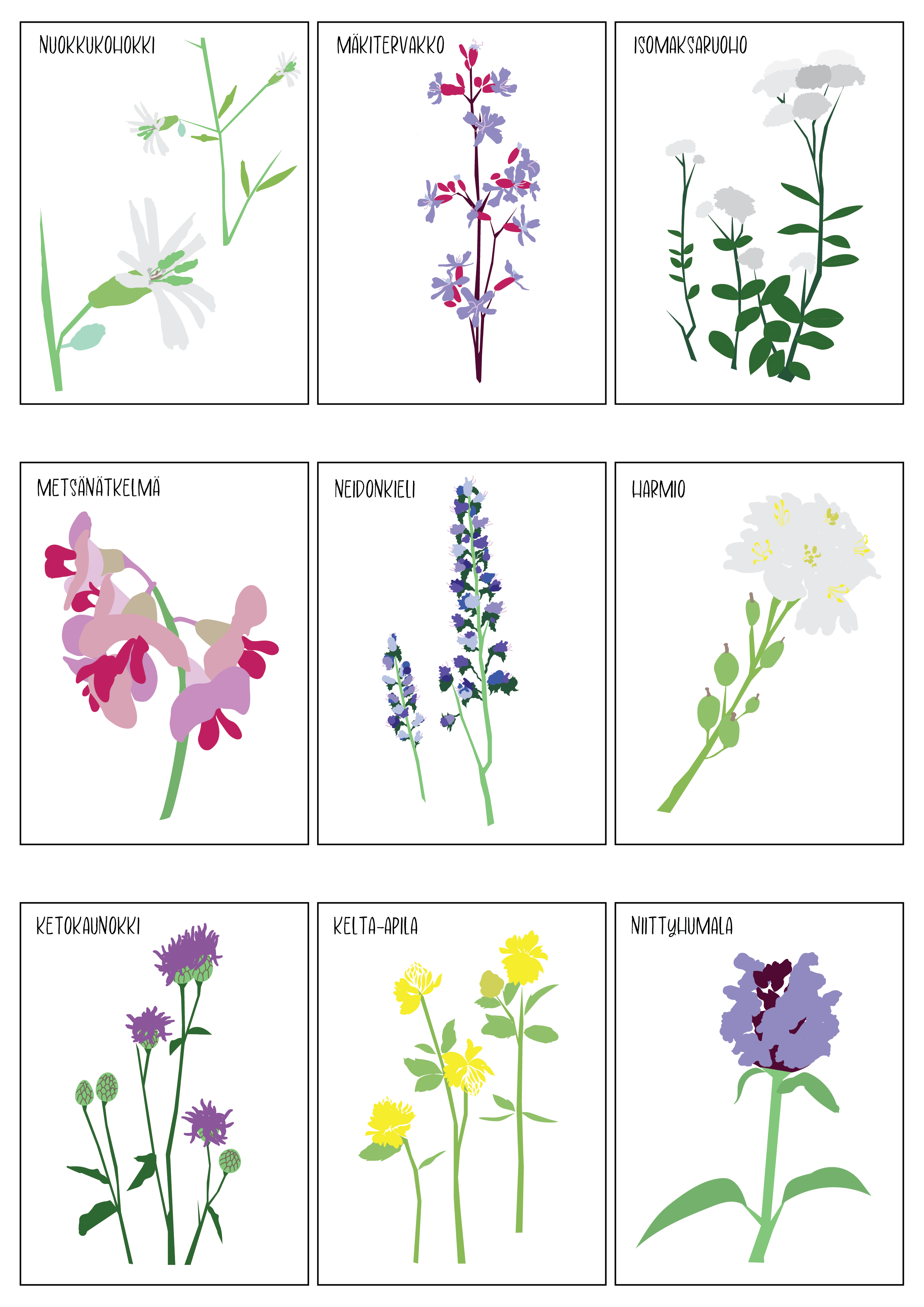
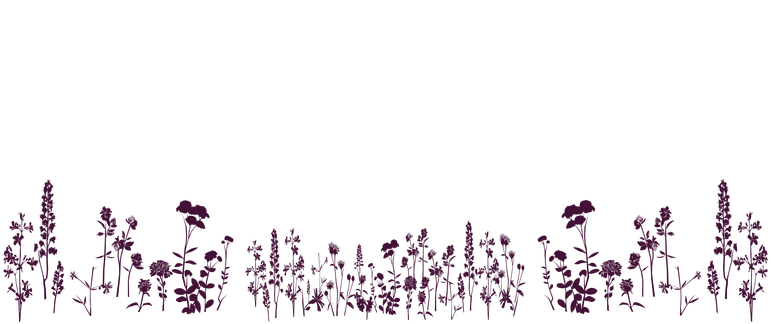
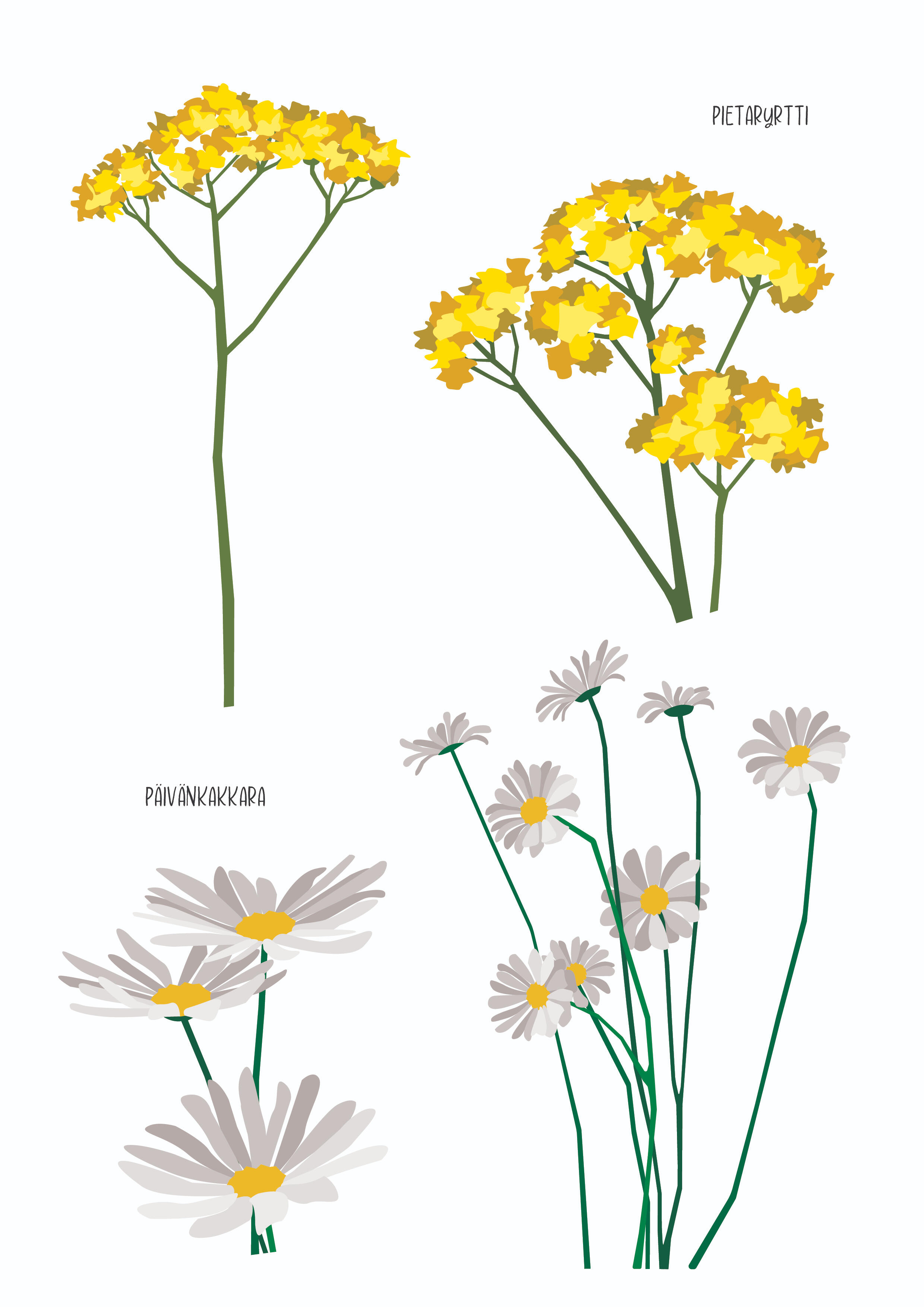
The flower illustrations were among the first things I set out to design. In total, I drew 11 different flower species for the project.I began the process by creating simple line drawings of the flowers and as the project progressed, we opted for a simple flat-color style for the flowers so that the illustrations would not be too distracting. I also created single-color meadow silhouettes using two different color options with the idea that
they could be placed against virtually any background to add visual interest—whether
it be an Instagram post or a presentation.The flower illustrations were created as
vector graphics in Adobe Illustrator.
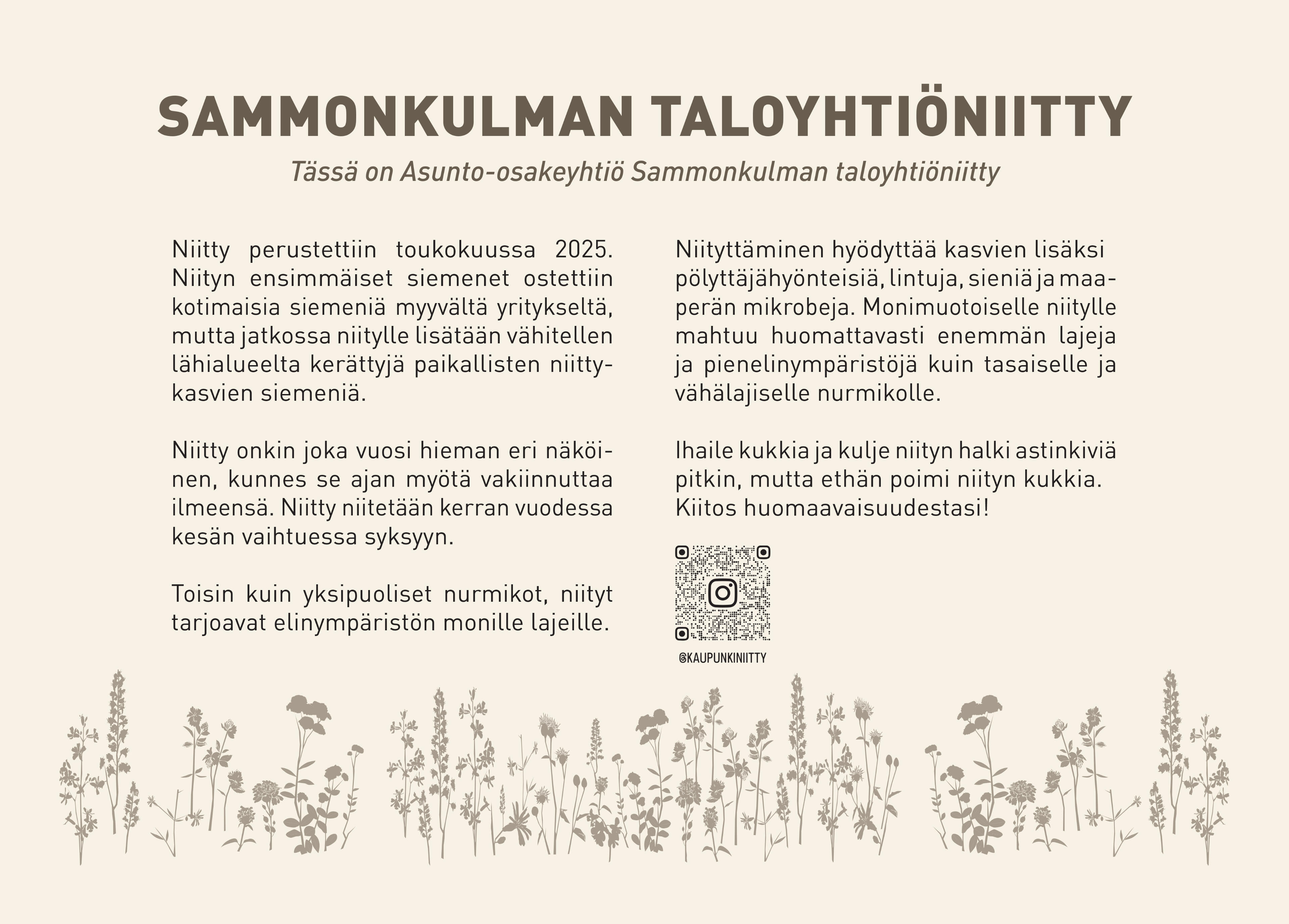
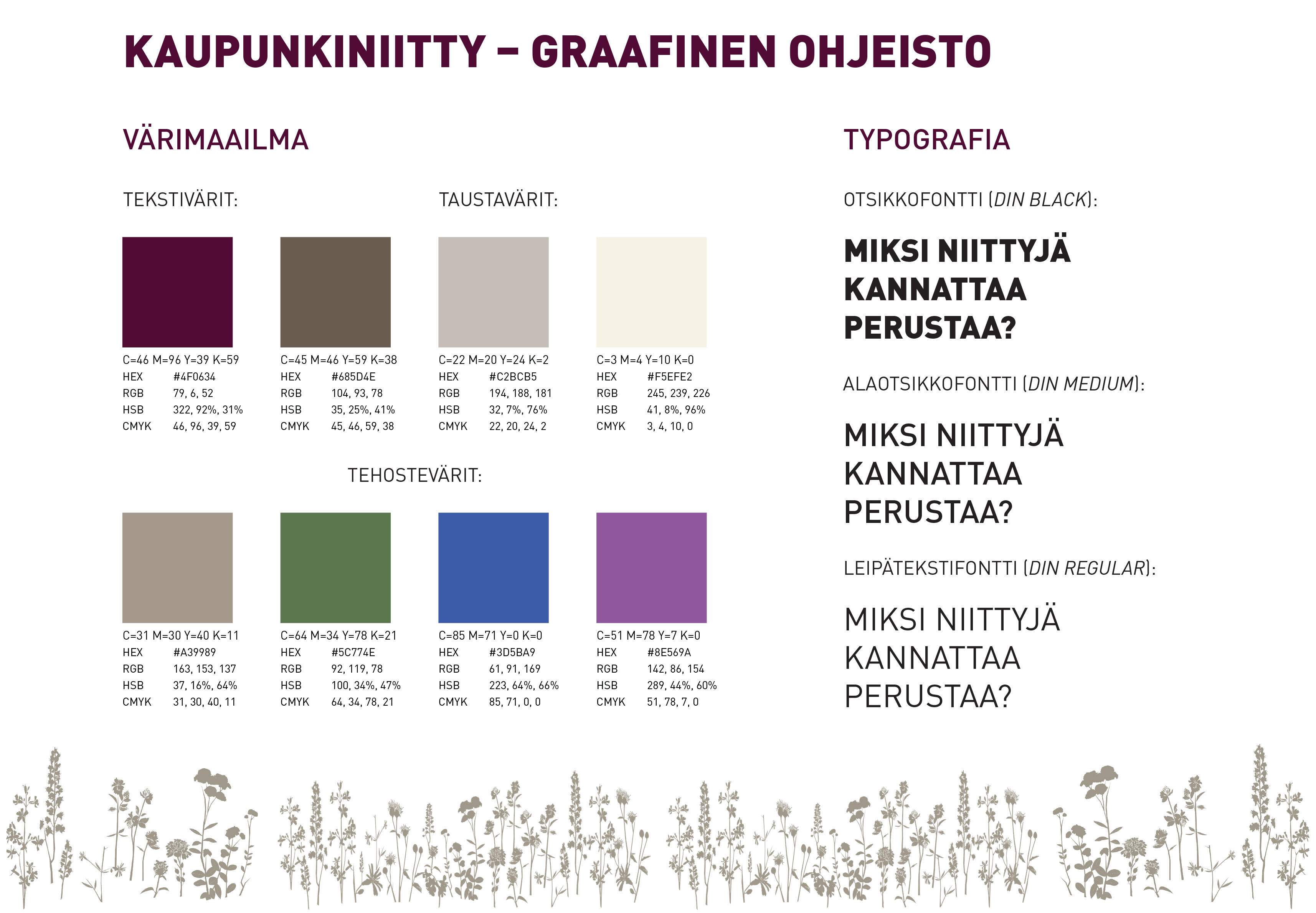
I started designing the visual identity for the Urban meadow project by establishing its color scheme. We explored various color palettes at the start of the project, but as the design progressed, we settled on two shades derived from the apartment building’s own colors as the base tones. Accent colors were drawn from the flowers planted in the meadow. The colors for the text were finalized towards the end of the visual design process, including two shades - a burgundy, used primarily for Instagram posts, and a brown tone, used for elements like the meadow’s info sign.I began working on the info sign for the Urban meadow in early spring 2026. The sign describes the creation of the meadow, the benefits it provides to the habitat, and its maintenance. It also features an embedded QR-code that links directly to the project's Instagram page. The text for the sign was produced
by Anna Isotalo.I was then asked to create an informational map for the Urban medow project, showing the Sammonkulma housing company meadow, the Kaleva Church meadow, and potential sites for
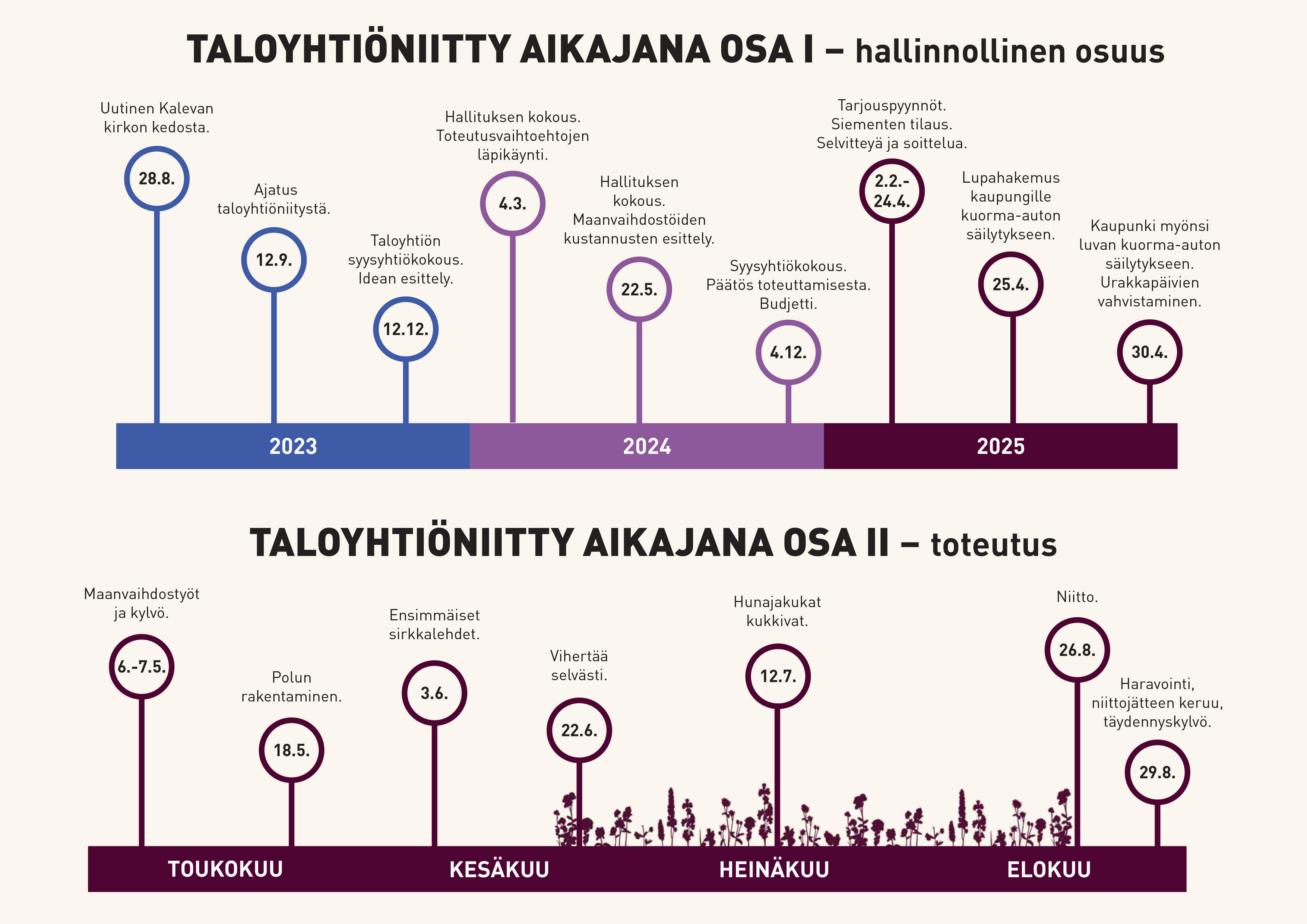
new housing company meadows. The map was intended primarily for use in presenting and marketing the project.The final visual element I did for the project was a two-part timeline: the first section outlines the administrative aspects of the project, while the second covers the actual implementation of the meadow. The infographic timeline illustrates the steps required both before and after sowing the meadow.
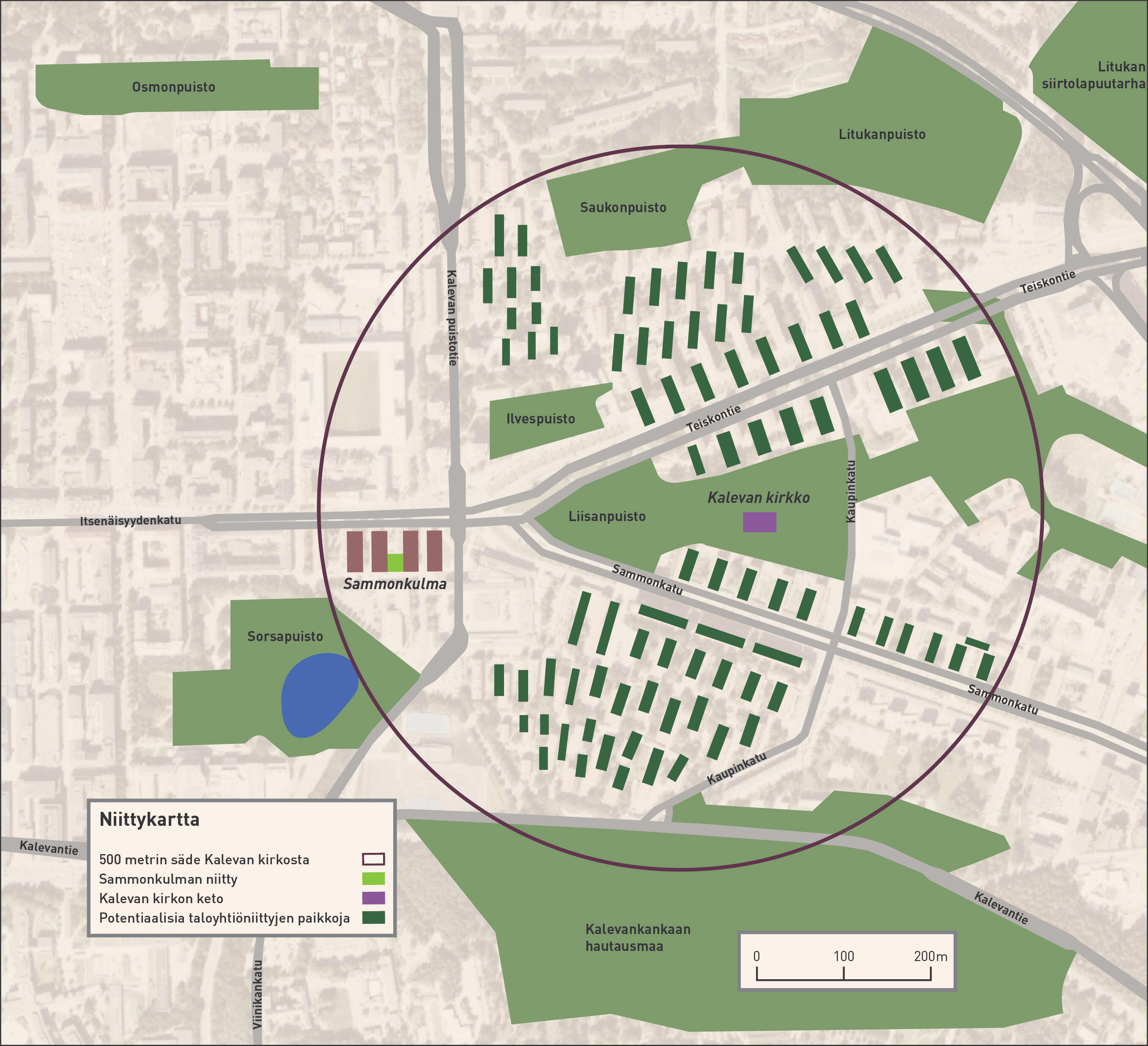
@kaupunkiniitty
The seasons
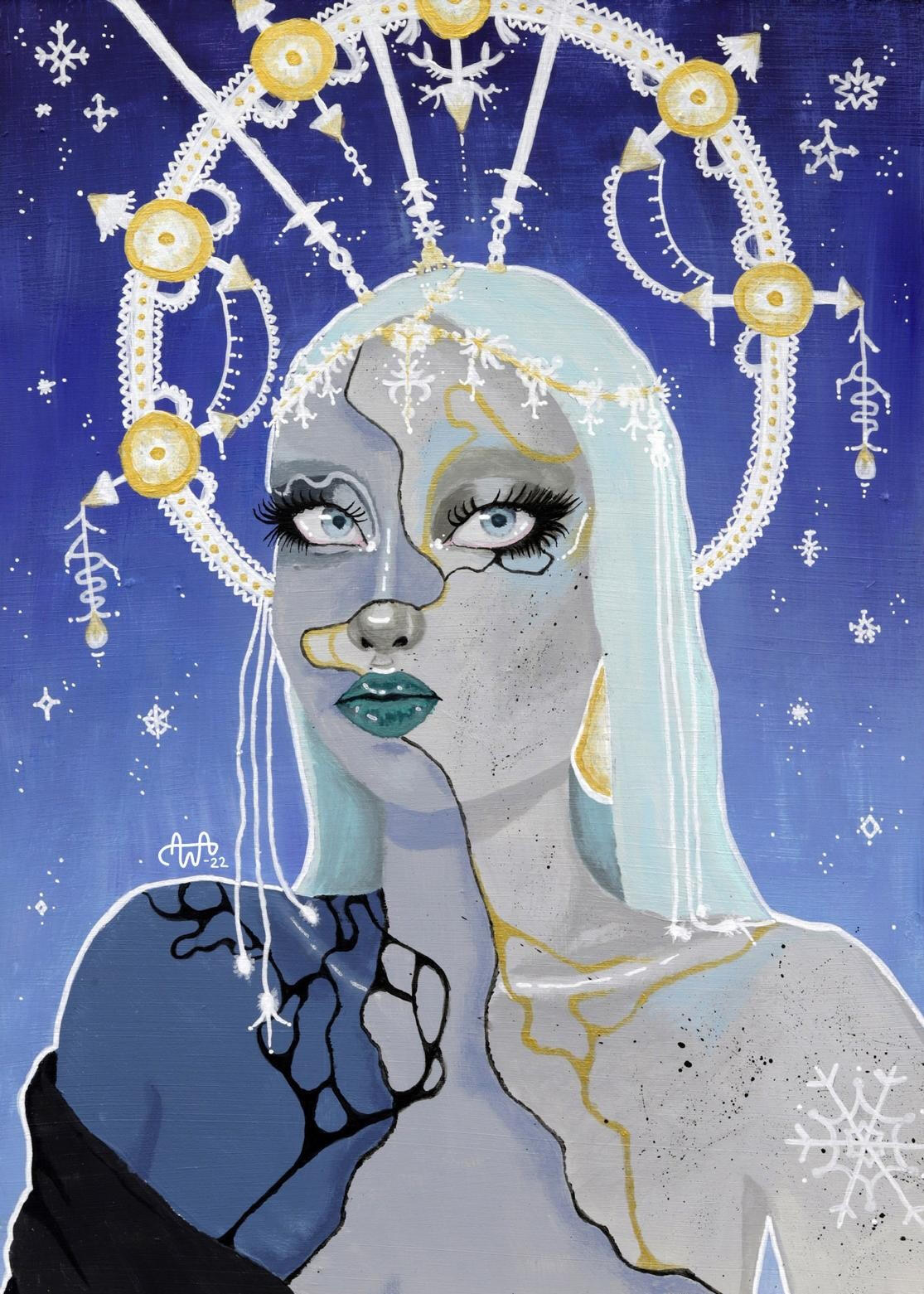
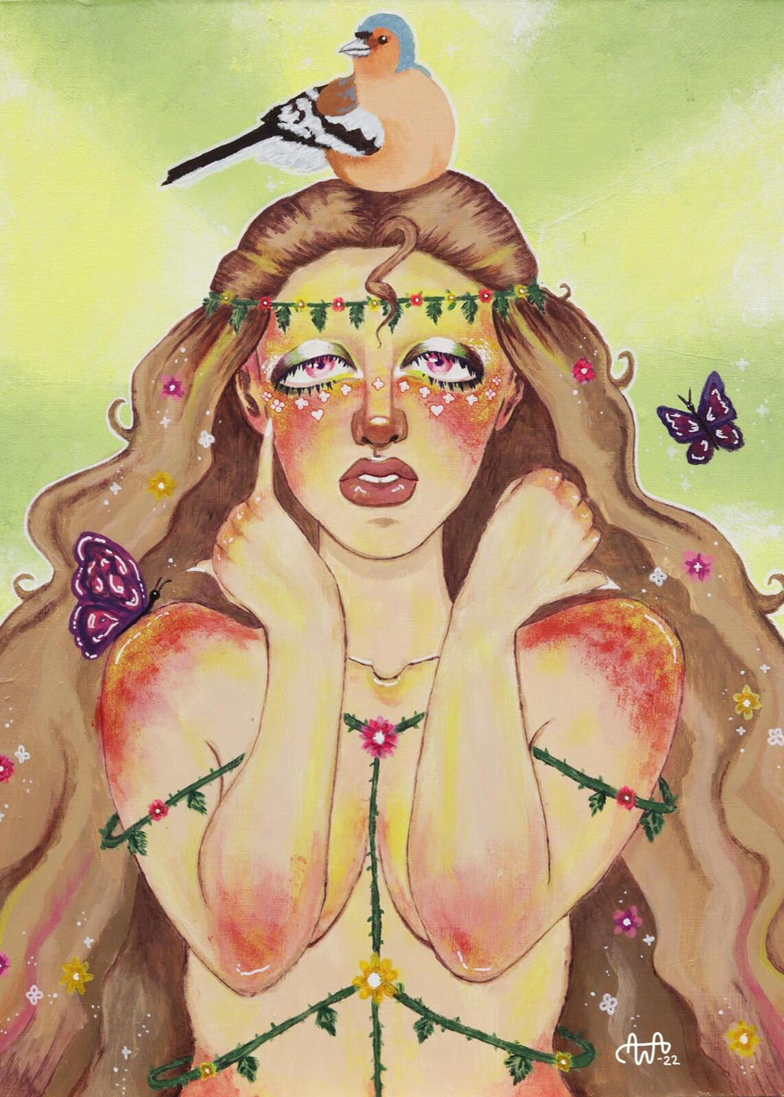
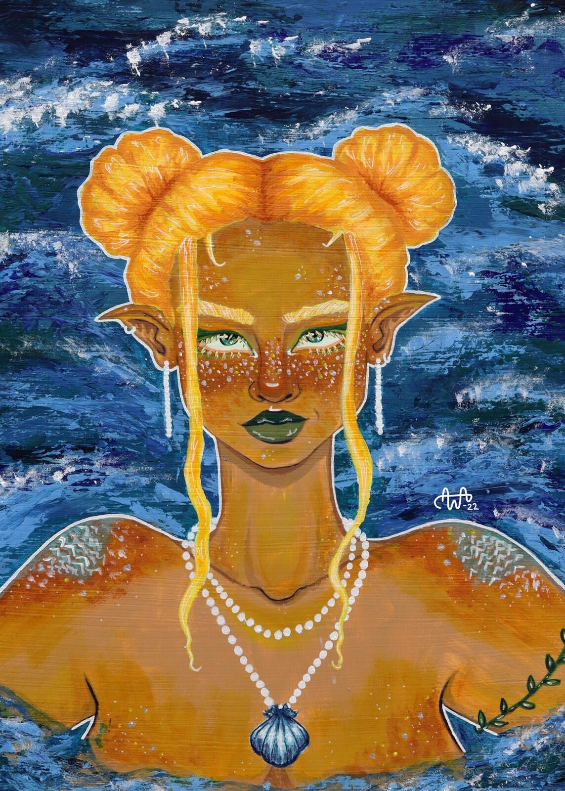
I created the acrylic painting series called "The Seasons" when I was studying at Ahlman's art program. I wanted to push my boundaries and get more comfortable with acrylic paints when I started to work on Winter. I liked its color scheme a lot and realized it reminds me of depictions of Snow Queen and kind of by accident ended up creatingthe Seasons - series based on it.
I wanted the characters to be colorful and fantasy-like, so I left realism behind and went for something more magical with every girl representing her season with different elements. All of the paintings' dimensions are 42cm x 59cm.The Seasons - series was on display at an art exhibition organised by Ahlman’s students in the spring of 2022.
the raven
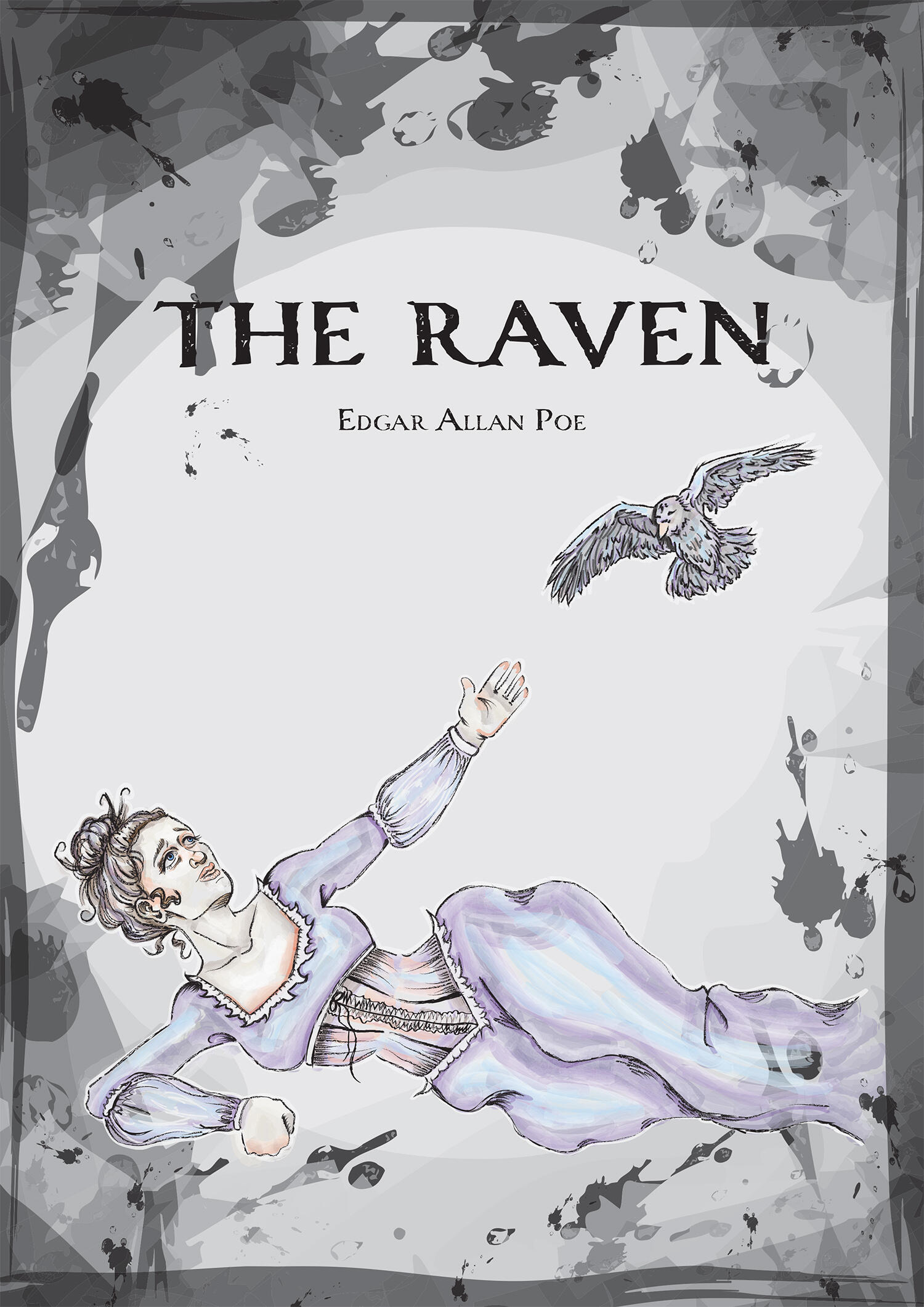
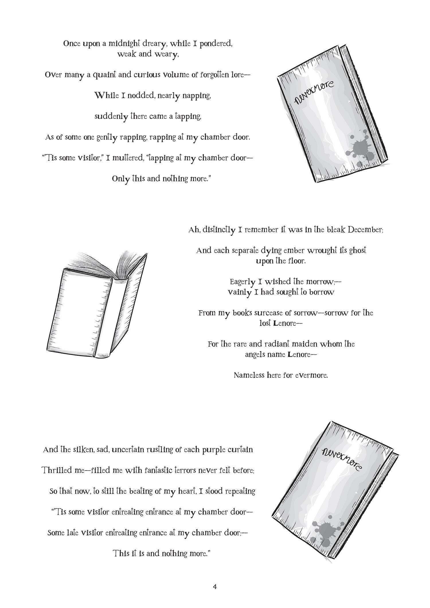
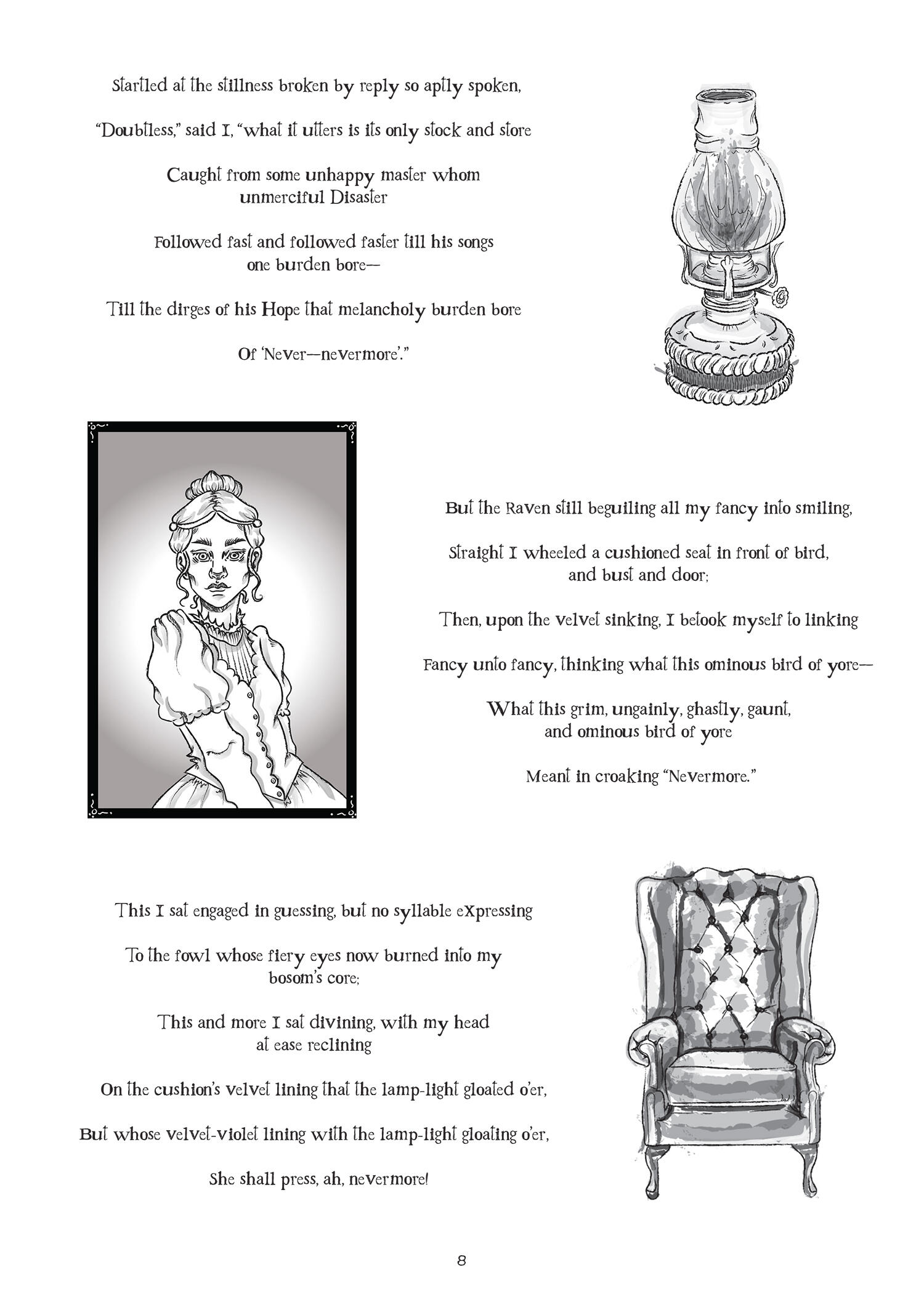
This illustration project for Edgar Allan Poe’s poem ”The Raven” was interesting. The illustrations were made with Adobe Illustrator, which was a relatively new application for me at the time, so drawing with it was challenging at first. However, with each illustration I learned something new about the software and working with it started to become more enjoyable.Since the poem is quite dark and leaves certain details up to the reader’s own interpretation, I thought for a long time about what kind of illustrations I wanted to include in this project. I eventually ended up with a black and white, slightly messy and obscure drawing style.I did the layout of the poem in Adobe InDesign and edited the text and illustrations simultaneously, so that I could create a collection of drawings that matched and flowed
well with the text.Technical info:
A3, illustrations made with Adobe Illustrator, typography and layouts made with Adobe InDesign, 2023
about me
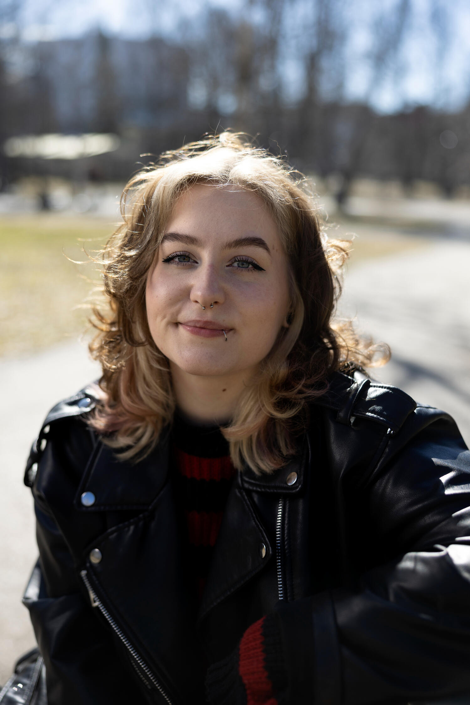
Hey and welcome to my portfolio page!
My name is Inka and I’m a 25-year-old illustrator and graphic designer from Tampere, Finland.In art I’m most inspired by colors, interesting concepts and artist’s own handprint in their work. I’m interested in comics, games, animation and musicals. By nature I’m curious and social. Taking initiative and problem-solving are also among my strengths.I’m fluent in Finnish and English so you can approach me in either language. If you have a project which requires graphic design or other visual skills send me an email and let’s work something out!
@amaceran